
Greetings Wikians! Rupert Giles here again to talk about global navigation. As many of you know, Wikia rolled out a new global nav back in December with the intention of gathering qualitative user feedback and quantitative engagement data. We mentioned in this post that we would be back in January to talk about next steps. Well, January is almost over and I wanted to bring everyone up to speed on our plans in the coming weeks.
You provided us with a lot of pointed feedback on the nav experience and how it affected individual communities and users. While we received feedback on a variety of subjects, there was fairly universal sentiment around a couple things - the nav was too intrusive (a combination of height, fixed placement, and theming) and the notifications were more difficult to use than before.
Given the general community sentiment around the new navigation and the fact that we didn’t see the improvements in numbers we had hoped for, it became obvious that we needed to make some changes. Our plan is to roll out these fixes in the coming weeks, and we will focus first on the most glaring issues to all users - the height and theming - before moving on to usability and minor visual improvements.
Here’s a list of separate changes you can expect to see in the coming weeks:
- The overall height of the nav will be shrunk by about 17%
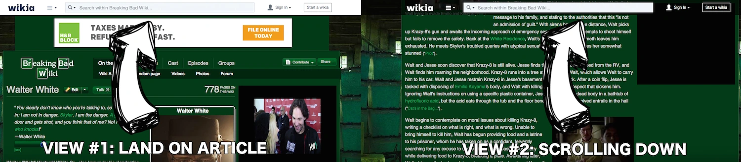
- As users scroll down the page the white Wikia theme will turn transparent thus “inheriting” most of the look and feel of the local community
- Notifications will once again be separate from the user menu
- The local / global search toggle will be tweaked to make the search call to action more clear and provide more space for notifications
- Various visual design changes will be made to the flyout menus to bring them in line with the new height and spacing of the nav itself
")
")
")
")
")
Even with the above changes we will still look for areas to improve so please continue to provide us with your feedback. If anyone has any questions or concerns, I will do my best to address them in the comments, and please report any bugs to Special:Contact.
Update 2/4/2015[]
The first round of planned updates to the global navigation have arrived, including a revised layout, reduced heights, and updated search design. The scrolling transparency, separated notifications, and updated flyout menus are not included, but more updates will be coming in future releases.
Update 2/11/2015[]
Second round of updates have dropped! Scrolling transparency is the headline feature. We also added a little drop shadow - let us know what you think!
Update 2/18/2015[]
Third round! We split out notifications from profile and added a tiny, almost-transparent button on the search bar so you can click instead of hitting enter. Thoughts?
Update 2/25/2015[]
In this latest round of updates, we made a few design tweaks to the hubs flyout menu! Again, please share your thoughts with us in the comments below.
Click here to follow the Fandom staff blog.
Click here to sign up for the From the Desk of Community email newsletter.
Join our Official Discord server for registered editors!