
Hey gang!
A couple of weeks ago, we gave you the first widely public preview of FandomDesktop, the unification of the desktop experiences of Fandom and Gamepedia. In that preview, we doubled down on our Community Connect commitment to “More is More” with you, meaning more transparency, more candidness, and more in-depth looks at changes well before they happen. In continuation of that commitment, let’s recap how article pages are changing with FandomDesktop with some additional insight into how we reached these changes.
Starting at the heart of the matter[]
When we talk about wikis being the core experience of Fandom, articles are the nucleus of that core experience. They are what you focus on as creators and they are why the vast majority of readers visit your wikis. The overwhelming majority of visits to your wikis begin with somebody clicking on a search result link for an article page. As such, starting with ways to enhance that experience, for both readers and logged-in editors, is - as Mr. Spock would say - entirely logical.
Solving for multiple use cases[]
Fandom and Gamepedia today have a fundamental difference of design when it comes to content presentation. Fandom’s Oasis skin presents all article content in a standard width design, which is proved to be better for reading text, as confirmed by research from the Wikimedia Foundation and IBM. Gamepedia’s Hydra skin presents article content in a wider view that is better for engaging with the heavy-duty data tables utilized by so many of its crafting and loot focused games, as showcased by the Official Path of Exile Wiki being almost an essential second-screen experience for playing the game.
For logged-in editors on Gamepedia, it’s an even wider experience, as the right ad rail disappears. In addition to those use cases existing on their respective platforms, we also had quite a bit of feedback from Fandom users over the years since Oasis released that, while the standard width view is great for some content, it isn’t always ideal and they’d like a wider experience if possible. We knew we needed to find a good way to satisfy both ends of this usage spectrum, so this was our approach...
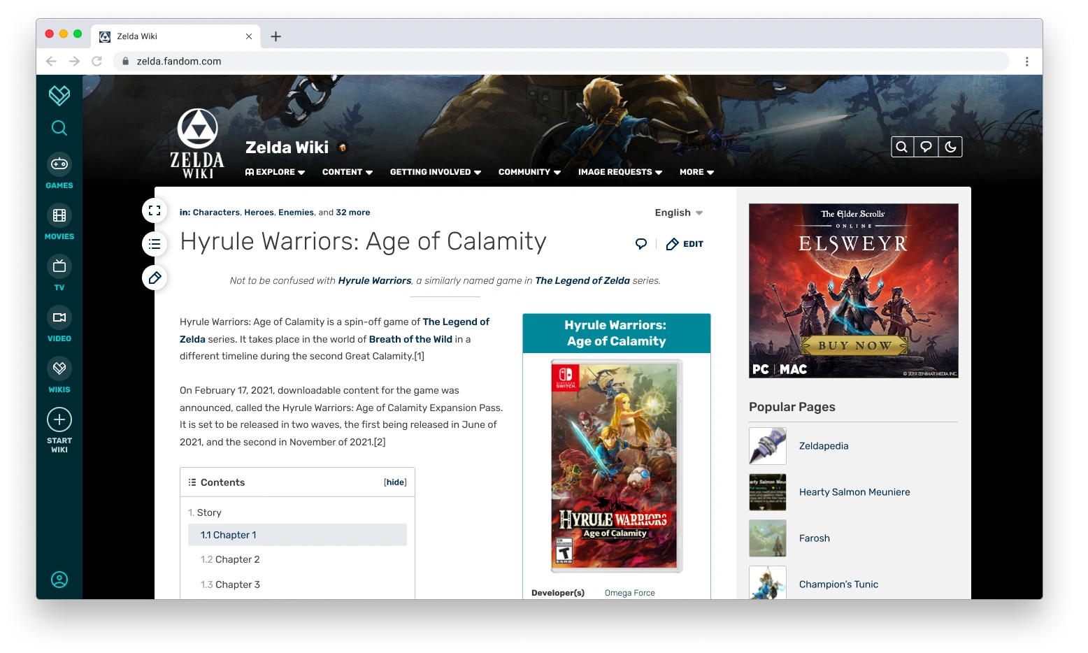
This is what the default logged out view would look like on FandomDesktop for the Zelda Wiki. Right now, Zelda Wiki is a combined Fandom and Gamepedia community currently residing on the Gamepedia design as a result of Project Crossover. You’ll notice that there is a fullscreen-looking button floating in the top left corner of the article content area, above a table of contents and edit button. That is the width toggle button and it is one of two big changes for article viewing in FandomDesktop. It takes the standard width view that is ideal for focused reading, and expands it into a full width view, which adjusts to the available width of your browser and is better for consuming data.
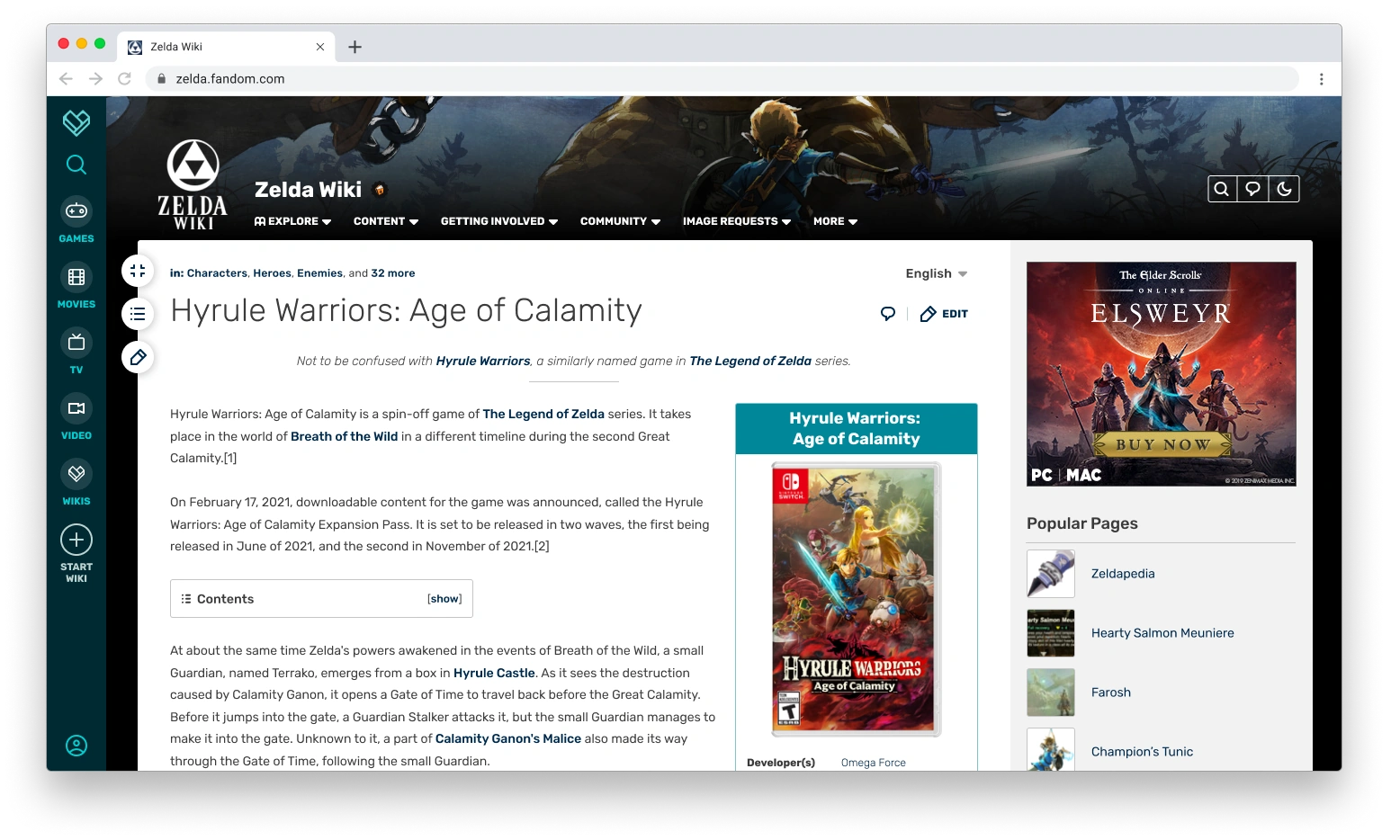
This is what it looks like at full width. It’s much wider than the current Fandom experience and comparable to the logged-out Gamepedia experience. As the web has evolved, so have monitor sizes, so having a standard width “one size fits all” approach in an age of so many different monitor options meant we weren’t properly serving our readers, so now we’re making that right.
Want to switch back to standard width? Press the toggle button again and it shoots you back. It just works.
But wait… there’s more![]
The detail-oriented readers of the blog (read: most of you) have surely noticed that I said the full width toggle is one of two big changes we’re making for viewing article pages. So, what’s the other one? Well, for logged-in editors, we’re adding a second option for controlling your viewing experience. Either by global preference or by on-page toggle, logged-in editors will have the option to hide the right rail on article pages, expanding the content area to even slightly wider than the logged-in view on Gamepedia today (1.1%, according to my 6th grade pre-Algebra skills - thanks Mrs. Waters!).
As I said, you can achieve this through either a user preference or by clicking that arrow toggle in the top right corner of the article page. This option comes as a result of direct feedback from the Community Council, Gamepedia Fellowship, Fandom and Gamepedia editors in 1-on-1 design research interviews, and Community Connect attendees. Editors wanted the option to see as much content space as possible and, faced with such united, actionable feedback, the decision was an easy one for us.
This is a logged-in user perk. The right rail is an advertisement vehicle for logged-out users, so the toggle is not something we can extend beyond logged-in users. This matches the design of Gamepedia’s full-width option, which is only available to logged-in users.
At the end of the day, we want to add a lot of value to the right rail for all users. It’s a great place for surfacing discovery and editor tools. That’s something we’ll be pursuing after the launch of FandomDesktop, when we dive into more projects on new editor tools, search enhancements, new avenues for discovery, and some things I can’t even tease yet. Since the additional value in the right rail isn’t coming with FandomDesktop’s launch, making you keep the right rail on the promise of some undefined future extra usefulness wasn’t the right choice. User agency is the play here. If you choose to toggle the right rail off, we want to earn that click from you to turn it back on and engage with the new stuff we put there later on.
And those other buttons?[]
Glad you noticed them, especially since I mentioned them in passing! We have added two persistent page tools which follow you in a scroll state: Table of Contents and Page Edit.
Our design team performed heat map testing of article pages which indicated that, while having the Table of Contents at the top of the page is a logical design, it doesn’t serve all the use cases in practice and actually adds more scrolling to a user experience. What’s the first thing someone does when they hit an article page? They start scrolling and blow right by the Table of Contents. If they’re on a long page and need help navigating it, they have to scroll all the way back up to the ToC.
As first debuted with the FandomMobile experience, the persistent Table of Contents button allows you to get to the article navigation quickly from any point on a page, which is particularly useful for long pages like Link’s page. No more need to scroll all the way back up for the Table of Contents. Just press the button and out it pops as a navigational element. No more scrolling back up to get to the table of contents on the Jon Snow page (one of the pages we did heat mapping on).
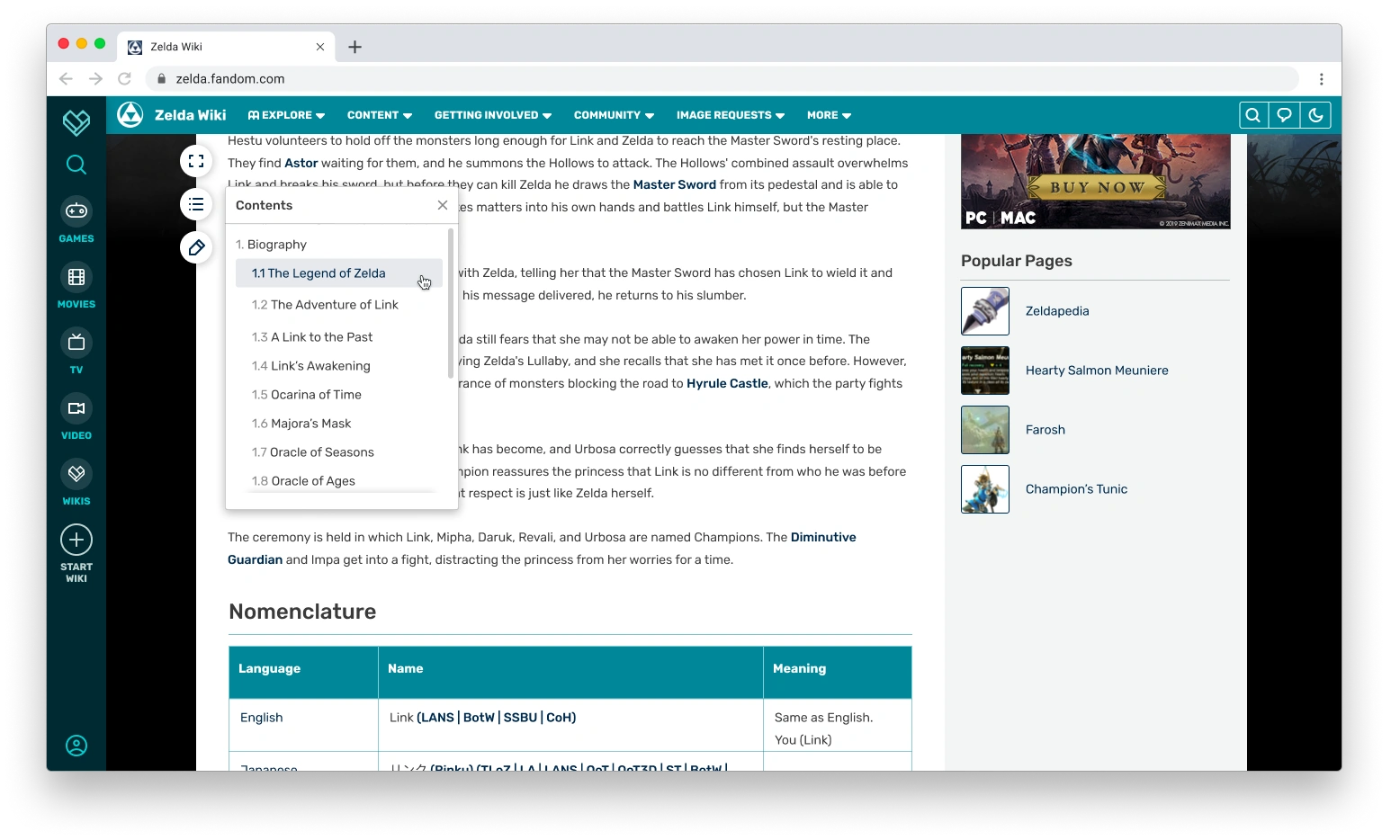
Like I said, this originally came from work on FandomMobile. We knew early on in that work that we wanted to have the Table of Contents as a persistent element that scrolls with you for better page navigation, since that experience of having to scroll back up to the top for the navigation is even worse when you’re on a touchscreen. While designing the FandomMobile experience we went through a few different iterations before we arrived at the button on the side that you see live on the mobile site today. One of the early explorations involved a ToC bar following you down the page, but we didn’t like how much content it covered, especially on phones. The small button off to the side, floating in the border of the content area made the most sense and we carried over that design to our work on FandomDesktop. Not only did it make sense from a continuity perspective, but with the expand view button and the Page Edit button, having a different setup for a persistent ToC entry point would be rather out of place for our users.
Once more, into the editor![]
Another noticeable visual change is the article header calls to action for Edit and Comments changed from a button style to an icon-only approach. The intent here was to let the content shine and present an immersive experience for our readers. To help with this we dialed back the visual footprint of secondary features which allowed the content to really come to the forefront like never before. We then carefully sprinkled in a few components that would help the reader move throughout the page, but still focused on keeping as small of a visual footprint as possible so they wouldn’t compete with your content.
The Page Edit button is one of two full page editor entry points in FandomDesktop’s article page design. There’s a traditional Page Edit entry in the top right corner of the page, but now you can also enter the full page editor experience anywhere on the page scroll. As a logged in editor, you still have access to section edit entry points throughout the page, but this additional fixed entry point gives you better access to the full experience wherever you are.
The Page Edit button’s visibility is dependent upon the user in question being permitted to edit the page they’re viewing. For example, a logged-out user on a wiki with anonymous editing disabled will never see the Page Edit button. Likewise, a logged-in editor viewing a page which is protected only for admins to edit will not see the Page Edit button.
More is More[]
This blog was billed as a look at how article pages were changing and, if you expected that we were going to be making big changes to content, I’m glad your expectation was subverted. The content itself? It just works. When users click on a Fandom search result link, they expect to see a table of contents, infobox, and links to other pages that will start their journey down the wiki rabbit hole. That’s not changing. Article pages remain the nucleus of the core experience that everyone knows and loves, and as a bonus we’ve found new opportunities to make experiencing the content better and with more user choices.
In addition to the big changes to width selections and page controls, we are also giving the entire article page a little polish. We’re making more use of MediaWiki standard components, which are in use on Gamepedia today and much more up to date than their Fandom counterparts. We’re also expanding our use of object oriented user interface theming, which makes the experience more modern. And we’re also applying Theme Designer to more components..
We had the perfect combination of feedback telling us something and an opportunity to do that thing: solving for more use cases of article consumption that either Oasis or Hydra address on their own while also refreshing the familiar experience.
| Skin | Logged-out options | Logged-in options |
| Oasis | Standard w/ rail | Standard w/ rail |
| Hydra | Full w/ rail | Full w/o rail |
| FandomDesktop | Standard w/ rail
Full w/ rail |
Standard w/ rail
Full w/ rail Standard w/o rail Full w/o rail |
Like we’ve said a few times: More is More.
What’s next?[]
There is a lot more to cover as part of the FandomDesktop work (and beyond!), so be on the lookout for blogs on customization and Theme Designer, global and local navigation, editor tools, and what we’re doing with the bottom toolbar (can you see it?).
In the meantime, start counting down until you get full width and Ultrawide Mode, as I’m calling the full w/o rail experience. FandomDesktop becomes available for testing later this spring, with existing wiki migrations happening this summer.
Please let us know what you think in the comments! Also happy to answer any questions that I can about what you’ve seen here.
If you’d like to read the research from IBM, here’s the link.

Click here to follow the Fandom staff blog.
Click here to sign up for the From the Desk of Community email newsletter.
Join our Official Discord server for registered editors!