
Hello EveryOne, all the stuffs are great at my wiki fornow,
well i've created a page in that page i got normal div box, see 1st photo+caption !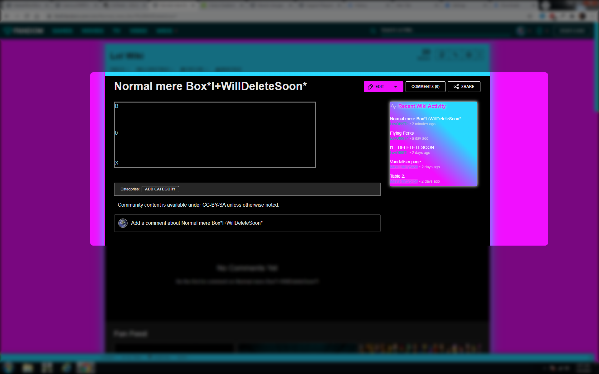
Watch that box, anyone can create it
Soooo i wanna add "Hover\Animated Border" in it's border, how can i do that? watch gif=
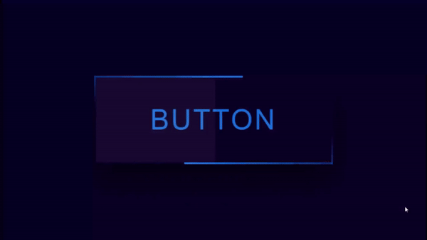
How can i add this type animated border for that normal box?
Yea , can i do that with help of media wiki:wikia.css ?
HelpAble links\things:
that box's code that i created at my wiki is:<div style="border: 3px solid gray; background: linear-gradient(to bottom, #000000 0%, #000000 100%); width: 75%; color:skyblue;">B 0 X</div>
+the gif i sent you, i've trimed that from a youtube video, HeRe , i can't give you the code of that gif, because i didn't find it any where at websites, can u figure that out?
Before giving me code or advising me, Also watch my entire mediawiki:wikia.css or just ignore it;
/**************/
/* Link hover */
/**************/
a:hover {
	text-shadow: #F10FFF 0 0 7px;
        color: #28D9FF !important;
	text-decoration:none;
	-webkit-transition: all .4s linear 0s;
	-moz-transition: all .4s linear 0s;
	-ms-transition: all .4s linear 0s;
	-o-transition: all .4s linear 0s;
	transition: all .4s linear 0s;
}

/* Colored Usernames */

/*------------------*/
/*--ADMINISTRATORS--*/
/*------------------*/
a[href="/wiki/User:LuvOf99Th"] {
    color: #1ABC9C !important;
}

/*------------------*/
/*--Content Modreators--*/
/*------------------*/
a[href$=":Masterkitty5450"],a[href$="/Masterkitty5450"]{
    color:#A45BFF!important;
    text-shadow:0 0 13px White;
    font-weight:bold !important;
}

a[href$=":IdleSquadron"], a[href$="/IdleSquadron"]{
    color: #FFFFFF !important;
    text-shadow:0 0 13px #FFFFFF; font-size: 110%;
    font-weight: bold;
    background: -webkit-linear-gradient(330deg, #a3d9ff, #ffa3f6, #FFFFFF, #ffa3f6, #a3d9ff);
    -webkit-background-clip: text;
    -webkit-text-fill-color: transparent;
}

/* Site glow */
.WikiaPage {
    border: 2px solid #F10FFF;
    box-shadow: 0px 0px 30px #28D8FF;
}

/** Scrollbar **/
/* WebKit and Blink */
::-webkit-scrollbar {
    width: 15px;
    height: 6px;
}
::-webkit-scrollbar-thumb {
 border:none !important;
 background: #28D9FF !important;
}

::-webkit-scrollbar-track {
    background-color: transparent !important;
}

/* Background image and color */
section#wikia-recent-activity {
	background-image: linear-gradient(to top right, #f10fff 33%, #28d8ff 67%);
    background-color: #27D8FE;
}

/* Heading color */
section#wikia-recent-activity h2 {
    color: #F10FFF;
    text-shadow:0 0 7px White;
}

/* Pulse Shrink */
@-webkit-keyframes hvr-pulse-shrink {
  to {
    -webkit-transform: scale(0.9);
    transform: scale(0.9);
  }
}
@keyframes hvr-pulse-shrink {
  to {
    -webkit-transform: scale(0.9);
    transform: scale(0.9);
  }
}
section#wikia-recent-activity {
    vertical-align: middle;
    -webkit-transform: perspective(1px) translateZ(0);
    transform: perspective(1px) translateZ(0);
    box-shadow: 0 0 10px White;
}
section#wikia-recent-activity:hover, section#wikia-recent-activity:focus, section#wikia-recent-activity:active {
    -webkit-animation-name: hvr-pulse-shrink;
    animation-name: hvr-pulse-shrink;
    -webkit-animation-duration: 0.3s;
    animation-duration: 0.3s;
    -webkit-animation-timing-function: linear;
    animation-timing-function: linear;
    -webkit-animation-iteration-count: infinite;
    animation-iteration-count: infinite;
    -webkit-animation-direction: alternate;
    animation-direction: alternate;
}

/* Background image and color */
section#recirculation-rail {
	background-image: linear-gradient(to top right, #28d8ff 33%, #f10fff 67%);
    background-color: #27D8FE;
}

/* Heading color */
section#recirculation-rail h2 {
    color: #F10FFF;
    text-shadow:0 0 7px White;
}

/* Buzz */
@-webkit-keyframes hvr-buzz {
  50% {
    -webkit-transform: translateX(3px) rotate(2deg);
    transform: translateX(3px) rotate(2deg);
  }
  100% {
    -webkit-transform: translateX(-3px) rotate(-2deg);
    transform: translateX(-3px) rotate(-2deg);
  }
}
@keyframes hvr-buzz {
  50% {
    -webkit-transform: translateX(3px) rotate(2deg);
    transform: translateX(3px) rotate(2deg);
  }
  100% {
    -webkit-transform: translateX(-3px) rotate(-2deg);
    transform: translateX(-3px) rotate(-2deg);
  }
}
section#recirculation-rail {
      vertical-align: middle;
      -webkit-transform: perspective(1px) translateZ(0);
      transform: perspective(1px) translateZ(0);
      box-shadow: 0 0 10px White;
}
section#recirculation-rail:hover, section#recirculation-rail:focus, section#recirculation-rail:active {
      -webkit-animation-name: hvr-buzz;
      animation-name: hvr-buzz;
      -webkit-animation-duration: 0.15s;
      animation-duration: 0.15s;
      -webkit-animation-timing-function: linear;
      animation-timing-function: linear;
      -webkit-animation-iteration-count: infinite;
      animation-iteration-count: infinite;
}

/* TOC restyling */
    .toc {
    -moz-border-radius:1ex;
    border-radius:3ex;
	box-shadow:0 0 10px inset #F10FFF;
	background: linear-gradient(to top left, #28d8ff 0%, #33ccff 100%);
}

/* Flip card */
    #flip-card {
        transition: transform 0.9s;
    }
    #flip-card-container:hover #flip-card {
        transform: rotateY(45deg) rotateZ(10deg);
    }
    #flip-card-container:active #flip-card {
        transform: rotateY(180deg) rotateZ(180deg);
    }
    #flip-card-side {
        backface-visibility: hidden;
    }

/* Images of Avatars */
.page-User_LuvOf99Th #userProfileApp {
    background-image: url(https://vignette.wikia.nocookie.net/central/images/b/bb/Julias_can_Fly...%21.png/revision/latest/scale-to-width-down/208?cb=20200702095609);
    background-position: right;
    background-repeat: no-repeat;
    background-size: 150px;
}

/* Pulse Grow */
@-webkit-keyframes hvr-pulse-grow {
  to {
      -webkit-transform: scale(1.1);
      transform: scale(1.1);
  }
}

@keyframes hvr-pulse-grow {
  to {
      -webkit-transform: scale(1.1);
      transform: scale(1.1);
  }
}

.customclass {
      display: inline-block;
      vertical-align: middle;
      -webkit-transform: perspective(1px) translateZ(0);
      transform: perspective(1px) translateZ(0);
      box-shadow: 0 0 1px rgba(0, 0, 0, 0);
}

.customclass:hover, .customclass:focus, .customclass:active {
      -webkit-animation-name: hvr-pulse-grow;
      animation-name: hvr-pulse-grow;
      -webkit-animation-duration: 0.3s;
      animation-duration: 0.3s;
      -webkit-animation-timing-function: linear;
      animation-timing-function: linear;
      -webkit-animation-iteration-count: infinite;
      animation-iteration-count: infinite;
      -webkit-animation-direction: alternate;
      animation-direction: alternate;
}

/* all profile tabs */
#userProfileApp .user-profile-navigation {
    border-bottom: 2px solid black;
}

#userProfileApp .user-profile-navigation__link {
      border: 2px solid black;
      border-bottom: 0;
      border-radius: 10px 10px 0 0;
      font-size: 14px;
      font-weight: normal;
      line-height: 23px;
      opacity: 1.0;
      padding: 5px;
}

#userProfileApp .user-profile-navigation__link a {
      color: black;
}

/* active (current) profile tab */
#userProfileApp .user-profile-navigation__link.is-active {
      background: linear-gradient(to top right, #27d8fe 15%, #f10fff 85%);
      border-bottom: 0;
}

#userProfileApp .user-profile-navigation__link.is-active a {
      color: black;
      font-weight: bold;
}

/* inactive profile tabs */
#userProfileApp .user-profile-navigation__link.false {
      background: linear-gradient(to bottom right, #27d8fe 15%, #f10fff 85%);
      border-bottom: 0;
}

#userProfileApp .user-profile-navigation__link.false:hover {
      border: 2px solid white;
      border-bottom: 0;
}
Pleas help, i really wanna do that...

