
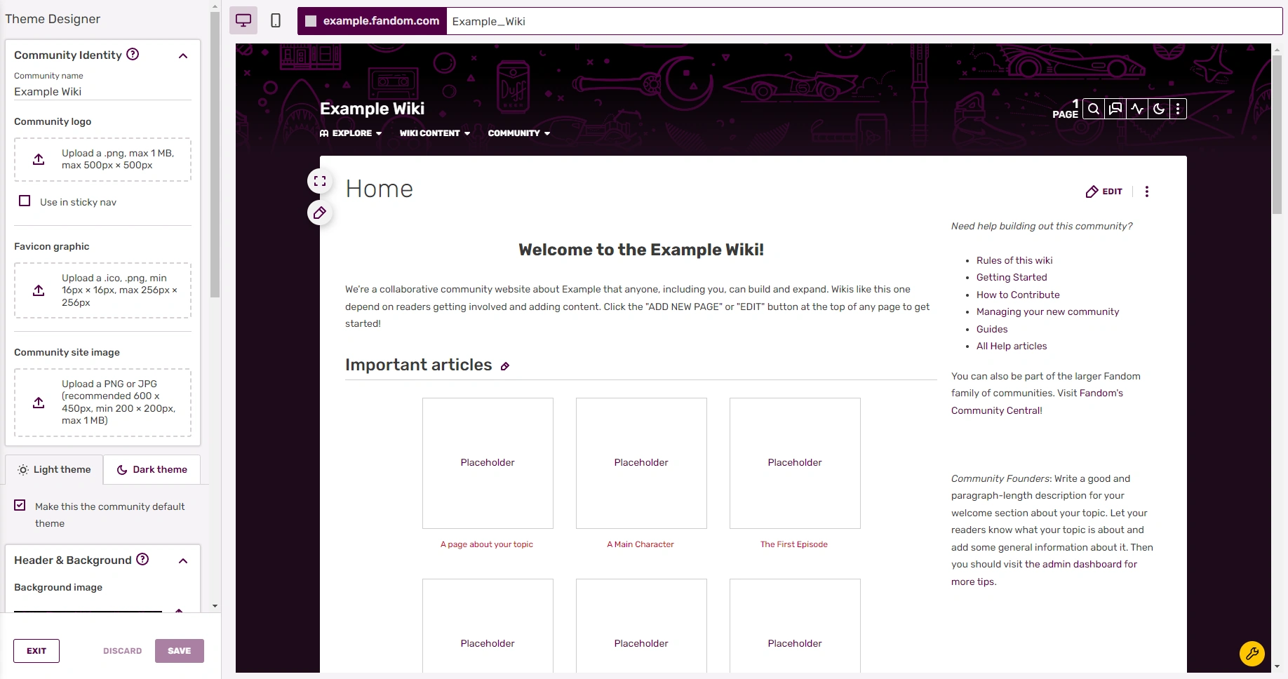
The Theme Designer is an easy-to-use admin tool that allows you to quickly customize your wiki's theme, header, and wordmark. You can choose from a pre-set theme or design your own unique theme that fits your community's topic.
Quick video tutorials on wiki design
Step-by-step
- As an admin of a community, you can find a link to the Theme Designer in the My Tools menu on the toolbar or in the Admin Dashboard. You can also navigate to it directly by visiting Special:ThemeDesigner on your wiki.
- You can access three tabs:
- Theme: Choose from a variety of pre-set themes, which can be used in whole or modified.
- Customize: Define the wiki background, the wiki header graphic of the navigation, and page attributes.
- Wordmark: Upload a unique graphic wordmark in addition to the community name and add a favicon.
- Every change made is immediately seen on the preview below, so you can see how your theme will look before you save it.
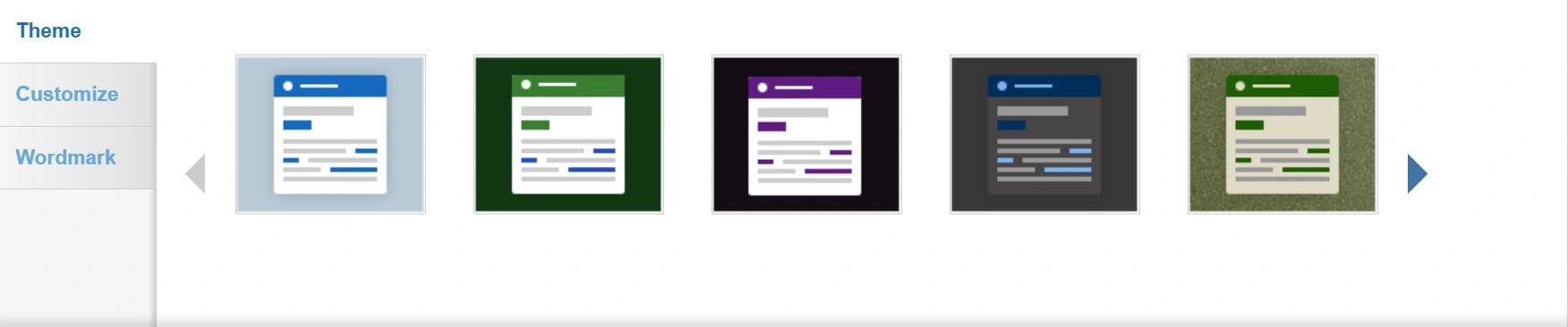
Themes
- You can choose from eleven pre-set themes by clicking on the theme you want. This will show you a preview of the theme below the designer.
- If you want to change parts of the theme you choose, simply click on the customize tab, and modify link colors, button colors, and more.
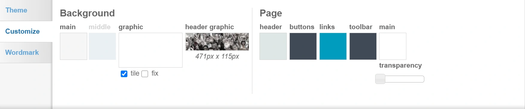
Customize
- Background: The background is the area outside of the content area and appears on all pages of your wiki.
- Click on the color swatch and select the background color of your choice in the color picker. Alternatively, you can enter a hex code.
- Depending on other settings you choose, a "middle" background color can be seen at larger screen sizes.
- You can choose to add a background design by choosing one of the images in the graphic picker. Some of these are transparent images and will use whatever background color you have already set.
- If you would like to add your own background image, click on the graphic picker and use the upload tool available. You can upload a .jpg, .png, or .gif. The maximum file size is 300 kilobytes. Background images may be divided in half on larger screens (most of the division is covered by the site's content area). This allows the same portions of the background image to remain aligned with the edges of the content area, no matter what display size the viewer has.
- Help:Background has further information and recommendations related to creating a custom background image for your community.
- You can tile the background image (so that it repeats across the page) by checking the "tile" box.
- If you do not wish to tile the graphic, it will appear once, and the background color will appear in the remaining space.
- You can fix the image (so it stays in place as you scroll down the page) by selecting "fix".
- For non-tiled background images wider than 2000px, a "no split" option is available. Using the "no split" option will prevent the splitting in half (mentioned above), and may be helpful if you add transparency to your content area. With this option selected, the content area will cover different parts of the background image, depending on the viewer's display size.
- The header graphic appears on all pages of your wiki where the navigation is located. For the header graphic, the same limits apply as for the backgound (.jpg, .gif, .png, maximum of 300 kilobytes). For optimal display, we recommend a file with the size of 471px x 115px. By default, it fades out to the middle of the page - keep that in mind when selecting an image!
- Click on the color swatch and select the background color of your choice in the color picker. Alternatively, you can enter a hex code.
- Page: Page options control the colors of the buttons, links, header, toolbar, and the content (main) area.
- Click on the color swatch under each category to change the color. A color picker will appear to let you choose a color or enter a hex code.
- You can change the transparency of the content area by moving the transparency slider.
- Notes:
- Changing the color of the page header will automatically switch the community name, tab names, page count and buttons on the right of the page between light and dark text, depending on the brightness of the chosen color. It will also change the color of the header in the "More on..." module in the Fan Feed.
- Changing the color of the "main" area will also change the background color of menu dropdowns (such as the navigation and "Edit" button dropdowns).
- Changing the color of the buttons will also change the background color of the infobox title and section header elements on portable infoboxes, as well as the one in the header of the user identity box. The color of the buttons will not change in the Comments and Share buttons.
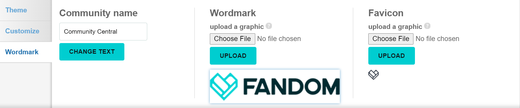
Wordmark
- The wordmark is a graphical addition to the Community name. Users can navigate to their preferred landing page of the wiki by clicking the wordmark on any page.
- Community name:
- You see the Community name in the header next to the wordmark. To change it, type in the new community name and click the "change text" button. Note that this does not change the sitename of the wiki.
- Wordmark:
- You can create and upload your own graphic wordmark.
- Wordmarks can only be .png files and can have a maximum size of 250px x 65px.
- The wordmark graphic is stored at File:Wiki-wordmark.png.
- Favicon:
- Favicons are small icons that appear at the top of your browser, and are frequently used in tabs and bookmarks.
- You can upload a favicon using the upload tool. Select "Choose File" and then select "Upload" to complete the process.
- Favicons can only be .ico files and must be 16 × 16 pixels in size. You can learn more about Favicons here.
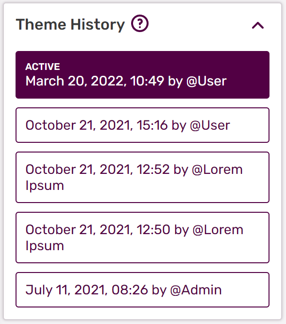
Saving and past revisions
- When you are finished, click "Save, I'm done" and your new theme will appear to users instantly!
- If you would like to see or revert to a past version, you can do so. Click on a past version and it will load in the preview area.
Next pages
- Learn more about how to create a custom background image for your community
- Learn how to edit the Community Corner
- Learn how to edit the navigation bar
- Learn how to edit your My Tools
Further help and feedback
- Browse and search other help pages at Help:Contents
- Check Fandom Community Central for sources of further help and support
- Check Contacting Fandom for how to report any errors or unclear steps in this article