m (What? | Undo revision 2959182 by Cosmicbonger (wall)) Tag: Help |
m (Since Wiki Representatives are being retired.) |
||
| (84 intermediate revisions by 52 users not shown) | |||
| Line 1: | Line 1: | ||
| ⚫ | The '''Theme Designer''' is an easy-to-use admin tool that allows you to quickly customize your wiki's theme, header, and logo. You can choose from a pre-set theme when creating your wiki for the first time, or design your own unique theme that fits your community's topic for both [[Help:Light and dark themes|light and dark themes]]. |
||
| − | <jwplayer media-id="9zHNJGc9" /> |
||
| ⚫ | |||
| + | == Step-by-step == |
||
| − | == Quick video tutorials on wiki design == |
||
| ⚫ | * As an admin of a community, you can find a link to the Theme Designer in the dropdown menu in the top right corner by hovering over the three vertical dots (⋮), in the '''[[Help:Toolbar|My Tools]]''' menu on the toolbar, or in the [[Help:Admin Dashboard|Admin Dashboard]]. You can also navigate to it directly by visiting '''Special:ThemeDesigner''' on your wiki. |
||
| − | <jwplayer media-id="IEUlATLs" /> |
||
| + | * There are three sections for customizing the wiki: |
||
| + | ** '''Community identity:''' Set the wiki's name and community graphics. |
||
| + | ** '''Header and background:''' Define the wiki [[Help:Background|background]] and color the local navigation. |
||
| + | ** '''Article styles:''' Define the colors for the article background and links, plus choose a font for headings. |
||
| + | [[File:Mobile theme preview.png|thumb|400px|You can switch between the desktop and mobile preview with the icons in the top left hand corner of the preview window.]] |
||
| + | * Every change made is immediately seen within the preview window, so you can see how your theme will look before you save it, both on desktop and on mobile. You can switch between the desktop and mobile preview by using the respective desktop monitor and smartphone icon in the top left corner of the preview window. |
||
| + | * Admins can customize a light and dark theme on their wiki, accessible in the Theme Designer through separate tabs, and choose which of the two will be the community's default theme. All options under the "Header & Background" and "Article Styles" can be defined per theme. When switching tabs, the preview also changes to display whichever theme is being customized. |
||
| + | To ensure that themes meet [[User blog:Jpearson/Creating Web Accessible Content on Fandom|accessibility requirements]], admins will not be able to save a theming choice that has bad [[Help:Contrast|contrast]] warnings. [[#Contrast warnings|See below]] for more details on this. |
||
| ⚫ | |||
| − | <jwplayer media-id="U38WGVTm" /> |
||
| − | == |
+ | == Mobile theming == |
| + | Mobile theming is enabled by default for all communities across Fandom, except for those with color contrast issues or historically Gamepedia wikis using custom mobile CSS. Gamepedia wikis with mobile CSS will never have mobile theming turned on automatically, but it can be enabled by request by a Staff member. For wikis with contrast issues, upon opening the Theme Designer, admins will see a banner across the top that reads "''Mobile theming is not yet turned on for this wiki. To enable mobile theming, please resolve any color contrast issues and save your changes.''" Once all contrast issues are manually resolved and the theme is saved, mobile theming will turn on automatically. Wherever mobile theming is newly enabled, admins will see a brief notification confirming it. |
||
| ⚫ | |||
| − | * You can access three tabs: |
||
| − | ** '''Theme:''' Choose from a variety of pre-set themes, which can be used in whole or modified. |
||
| − | ** '''Customize:''' Define the wiki background, the wiki header graphic of the navigation, and page attributes. |
||
| − | ** '''Wordmark:''' Upload a unique graphic wordmark in addition to the community name and add a [[Help:Favicon|favicon]]. |
||
| − | * Every change made is immediately seen on the preview below, so you can see how your theme will look before you save it. |
||
| ⚫ | |||
| + | [[File:Mobile theme - theming switch.png|350px|left|thumb|Users can easily switch between light and dark theme]] |
||
| − | === '''Themes''' === |
||
| + | To allow for a consistent aesthetic between the desktop and mobile experience, the colors set in the Theme Designer for the background, sticky nav, and header, as well as the accent, link, and article background colors will be the same on desktop and mobile. The chosen background image and heading font per theme will also be the same on desktop and mobile. |
||
| − | * You can choose from eleven pre-set themes by clicking on the theme you want. This will show you a preview of the theme below the designer. |
||
| − | * If you want to change parts of the theme you choose, simply click on the customize tab, and modify link colors, button colors, and more. |
||
| ⚫ | |||
| + | Note that not all options offered by the Theme Designer for desktop will be applicable to the mobile theme, and any additional changes made to the desktop theme with CSS will not apply to mobile. |
||
| − | === '''Customize''' === |
||
| ⚫ | |||
| − | ** Click on the color swatch and select the background color of your choice in the color picker. Alternatively, you can enter a hex code. |
||
| − | *** Depending on other settings you choose, a "middle" background color can be seen at larger screen sizes. |
||
| − | ** You can choose to add a background design by choosing one of the images in the graphic picker. Some of these are transparent images and will use whatever background color you have already set. |
||
| − | ** If you would like to add your own background image, click on the graphic picker and use the upload tool available. You can upload a .jpg, .png, or .gif. The maximum file size is 300 kilobytes. Background images may be divided in half on larger screens (most of the division is covered by the site's content area). This allows the same portions of the background image to remain aligned with the edges of the content area, no matter what display size the viewer has. |
||
| ⚫ | |||
| − | ** You can tile the background image (so that it repeats across the page) by checking the "tile" box. |
||
| − | *** If you do not wish to tile the graphic, it will appear once, and the background color will appear in the remaining space. |
||
| − | ** You can fix the image (so it stays in place as you scroll down the page) by selecting "fix". |
||
| − | ** For non-tiled background images wider than 2000px, a "no split" option is available. Using the "no split" option will prevent the splitting in half (mentioned above), and may be helpful if you add transparency to your content area. With this option selected, the content area will cover different parts of the background image, depending on the viewer's display size. |
||
| − | ** The header graphic appears on all pages of your wiki where the navigation is located. For the header graphic, the same limits apply as for the backgound (.jpg, .gif, .png, maximum of 300 kilobytes). For optimal display, we recommend a file with the size of 471px x 115px. By default, it fades out to the middle of the page - keep that in mind when selecting an image! |
||
| − | * '''Page''': Page options control the colors of the buttons, links, header, toolbar, and the content (main) area. |
||
| − | ** Click on the color swatch under each category to change the color. A color picker will appear to let you choose a color or enter a hex code. |
||
| − | ** You can change the transparency of the content area by moving the transparency slider. |
||
| + | The chosen default theme of light or dark will also be the default for the mobile theme. However, just as on desktop, each user will be able to choose their own theme experience on a personal basis. The personal theming choices one makes on mobile carry over to desktop and vice versa. More information about the light and dark theme experience can be found [[Help:Light and dark themes|here]]. |
||
| − | *'''Notes:''' |
||
| − | ** Changing the color of the page header will automatically switch the community name, tab names, page count and buttons on the right of the page between light and dark text, depending on the brightness of the chosen color. It will also change the color of the header in the "More on..." module in the [[Help:Fan Feed|Fan Feed]]. |
||
| ⚫ | |||
| − | ** Changing the color of the buttons will also change the background color of the infobox title and section header elements on [[Help:Infoboxes|portable infoboxes]], as well as the one in the header of the [[Help:Profiles|user identity box]]. The color of the buttons will not change in the [[Help:Comments|Comments]] and Share buttons. |
||
| ⚫ | |||
| − | + | == Community identity == |
|
| + | This section allows for the customization for the community name, logo, [[Help:Favicon|favicon]], and site image. These settings are independent of light/dark themes and will display the same on both. |
||
| ⚫ | |||
| − | * '''Community name:''' |
||
| ⚫ | |||
| − | * '''Wordmark:''' |
||
| − | ** You can create and upload your own graphic wordmark. |
||
| ⚫ | |||
| ⚫ | |||
| − | * '''Favicon:''' |
||
| ⚫ | |||
| − | ** You can upload a favicon using the upload tool. Select "Choose File" and then select "Upload" to complete the process. |
||
| ⚫ | |||
| ⚫ | |||
| ⚫ | |||
| − | ==== Saving and past revisions ==== |
||
| + | |||
| ⚫ | |||
| ⚫ | |||
| ⚫ | |||
| ⚫ | |||
| ⚫ | |||
| + | ** '''Use in sticky nav:''' will include the logo on the far left of the sticky nav, visible after scrolling down. |
||
| ⚫ | |||
| ⚫ | |||
| + | ** The favicon is stored at '''File:Site-favicon.ico'''. |
||
| + | * '''Community site image:''' This image will represent the community across Fandom and appear in various places including search and profile. As such, a high-quality image is recommended since it will appear in multiple sizes across different browsers and devices. |
||
| + | ** The site image can be .png or .jpg, and the recommended size is 600 × 450 pixels with a minimum size of 200 × 200 pixels. The maximum upload size is 1 MB. |
||
| + | ** The image is stored at '''File:Site-community-image'''. |
||
| + | |||
| + | == Header and background == |
||
| ⚫ | |||
| ⚫ | |||
| + | * '''Background image''': If you'd like your wiki to have a background image, click in this area to upload one. The permitted file types are .jpg, .png, and .gif. The maximum file size is 1 MB. |
||
| ⚫ | |||
| + | ** Below the upload area, there is an option for the chosen background image to be displayed on mobile as a header image. If left unchecked, it will not appear on the mobile theme. When enabling mobile theming, the default is to ''not'' show the background. |
||
| + | ** '''Image display''' controls whether the image covers the entire screen or just the header area above the article. The background can be customized with a header (recommended 2880 × 656 pixels) or full-screen (recommended 2880px square) image. |
||
| + | ** '''Background image style''' contains various options for how to display the image. |
||
| + | *** '''Cover''': stretches the smaller dimension of the image as much as needed to fill the full screen (equivalent to CSS <code>background-size:cover</code>). |
||
| + | *** '''Tile''': this repeats the background image across the page, with the options to do so horizontally, vertically, or both. |
||
| + | *** '''Fit''': the image will be aligned to the selected area (top left, center, or top right), and the larger dimension of the image will be stretched to fit (equivalent to CSS <code>background-size:contain</code>). |
||
| + | ** '''Image opacity''' sets how see-through the background image is against the background color. The lower the percentage, the more transparent the image becomes, which is useful to allow for better contrast of elements. Alternatively, you can adjust the community header text color to achieve this. |
||
| + | |||
| + | The following color choices will be applied to '''both the desktop and the mobile theme''': |
||
| + | * '''Community background color:''' sets a solid background color for the wiki. |
||
| + | * '''Sticky nav background color:''' sets the background color of the sticky nav, visible at the top of the screen after scrolling down. Text color is automatically determined for contrast. |
||
| + | * '''Community header color:''' sets the text color of the community header nav. Pick something that has sufficient contrast with the background image and color, or you will not be able to save your theme. |
||
| + | |||
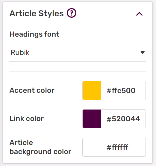
| + | == Article styles== |
||
| ⚫ | |||
| + | |||
| + | The following choices will be applied to '''both the desktop and the mobile theme''': |
||
| + | * '''Headings font:''' allows for changing the font family of headings within articles. The default is "Rubik", though other other options are "Work Sans", "Lora", "Roboto Slab", "BioRhyme", and "Inknut Antiqua" |
||
| + | * '''Accent color:''' On desktop, the accent color is used on primary (filled) and secondary (outlined) buttons, the QuickBar, the comment counter on article/blog pages, [[Help:Infoboxes|infobox]]: the header, section header and border, and the vertical bar on site notices. On mobile, it's used on buttons, infobox borders, midlight (the color behind a text header/title), and on the toggle switcher. |
||
| + | * '''Link color:''' is the color of most links. Try to pick something that has good contrast with the article background, is distinct from normal text, and avoid red colors as red links denote missing pages. |
||
| + | * '''Article background color:''' is the background color of the main content area. The text color will be automatically determined for best contrast. |
||
| ⚫ | |||
| + | |||
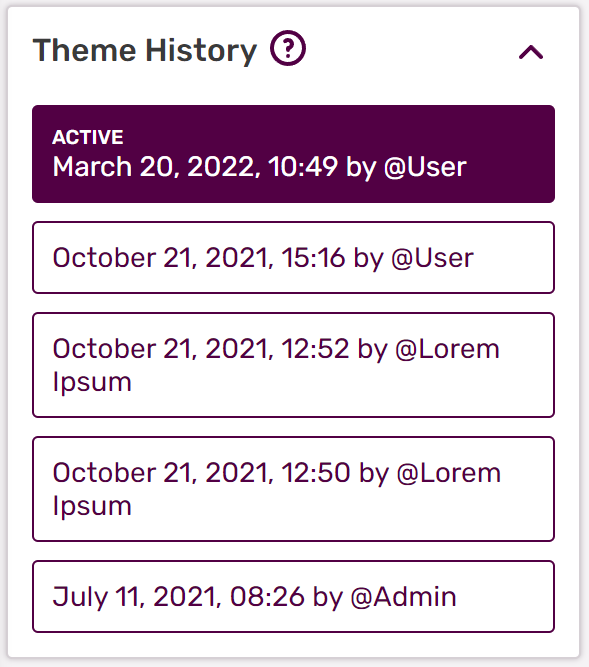
| + | == Theme history == |
||
| ⚫ | |||
| + | * Every time a theme is saved with the "Save" button, an entry is created in this list. The list is unique for both the light and dark theme. |
||
* If you would like to see or revert to a past version, you can do so. Click on a past version and it will load in the preview area. |
* If you would like to see or revert to a past version, you can do so. Click on a past version and it will load in the preview area. |
||
| + | * Only the last 10 versions are saved. Minimizing the amount of times you save by making all your changes at once will keep the history informative and usable. |
||
| − | : [[File:Theme designer - history.png|400px]] |
||
| + | |||
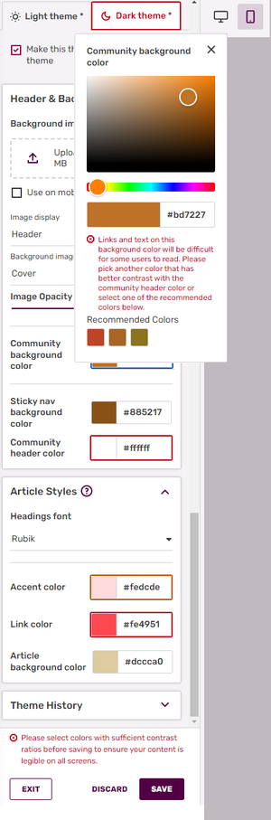
| + | == Contrast warnings == |
||
| + | The intent is to provide enough contrast between text and its background so that it can be read by people with moderately low vision. To ensure compliance, the Theme Designer's "SAVE" button is grayed out as long as contrast errors exist for one or more of the colors chosen on either of the themes, and an error message highlighting the problem will be present above the SAVE button. It is only after '''all required contrast errors for light ''and'' dark theme are resolved''' that the message near the SAVE button will disappear, and you can save your changes. |
||
| + | |||
| + | [[File:Theme Designer - contrast errors.png|300px|thumb|Red highlights indicate contrast errors in the Theme Designer, per color and per theme.]] |
||
| + | |||
| + | While errors are active, each affected color is highlighted by a red box around the chosen color, and the error text shows up in red with an octagonal error sign in front of it. Contrast warnings on the other hand are indicated with an orange box around the relevant color, and the warning text shows up in orange with a warning triangle in front of it. If the error is caused by color choices on the other theme, i.e. the light theme when you're looking at the dark theme, or vice versa, a red box will be present around the theme tab to draw attention to it. If the only issue on the other theme is a warning, the box around the theme tab will be orange. |
||
| + | |||
| + | The message for each color is unique and explains why this is an issue. You trigger this message by clicking on the color highlighted as having a problem. For each contrast issue, three colors on the spectrum adjacent to the one chosen that do meet the minimum contrast ratio will be presented to give admins an easy way to resolve the problem. This popup will remain open while looking for a new color, and the error or warning message will reappear if you switch the color to something that does not meet the contrast requirements. Once a good color solution is found, click on the "X" or outside the popup to make it disappear. |
||
| + | |||
| + | The '''required''' minimum [[Help:Contrast/Advanced|contrast ratios]] (based on WCAG 2.x AA) are: |
||
| + | === Link color vs article background - 4.5=== |
||
| + | If the problem lies with the link color on the chosen background color, you will read, "''Links displayed in this color may be difficult to read. We recommend you pick another color that has better contrast with the background color.''" |
||
| + | |||
| + | ====Link underlines==== |
||
| + | Some color suggestions for the link color to fix this contrast issue will potentially cause the link color to be closer or too close to the text color, which is automatically defined on Fandom based on the article background color (<code>#3a3a3a</code> on light theme and <code>#e6e6e6</code> on dark theme). This can disguise the links as regular text and make them harder to read. To counter this, when the chosen link color has less than a 1.5 contrast rating with the surrounding body text, the links will be underlined automatically to distinguish them properly. The underlines will disappear as soon as a link color with the proper contrast is selected, which can be seen in real time in the preview window. Note that underlines will only appear for links in the body text of wiki pages and will '''not''' be present in areas like the navigation bar, right rail, table of contents, templates or category pages. |
||
| + | |||
| + | ===Community background color vs community header color - 4.5=== |
||
| + | When the community background color and community header color do not have sufficient color contrast, they can make the local nav unreadable. If there are issues with the contrast here, the error message will read, "''Links and text on this (background) color will be difficult for some users to read. Please pick another color that has better contrast with the community header color/community background color or select one of the recommended colors below.''" |
||
| + | |||
| + | Note that when a background image is present, this error will not appear, due to the fact that any contrast issues are covered up by the image. However, there is the option to not display the background image on mobile, so if an image is not being used there, the contrast issues will still be noticeable on the mobile view. In that case, we recommend solving the contrast error using the mobile preview window rather than the desktop preview. |
||
| + | |||
| + | The '''recommended''' minimum contrast ratios are: |
||
| + | |||
| + | ===Accent color vs article background color - 3.0=== |
||
| + | Because the accent color defines the colors of various wiki elements, such as buttons, elements of the infobox, and QuickBar, and is thus sometimes displayed over the article background color, a poor contrast choice can make this blend in with the background. Should this occur, the following error message will be displayed: "''This color is used for infobox headers and borders, buttons, and other secondary interface elements. Please choose a color that has sufficient contrast to your wiki's article background color.''" This is simply a recommendation, not a strict requirement, so you will still be able to save your theme without having to adjust the accent color. |
||
| + | |||
| + | Keep in mind that only one color in each pair ''needs'' to be changed in order to meet contrast guidelines. When unable to resolve contrast issues in a satisfactory manner, please use the [https://support.fandom.com/hc/en-us/requests/new?ticket_form_id=360000940393 Zendesk form] to reach Fandom Staff. |
||
| − | == |
+ | == Further reading == |
* Learn more about how to create a custom [[Help:Background|background]] image for your community |
* Learn more about how to create a custom [[Help:Background|background]] image for your community |
||
| − | * Learn |
+ | * Learn more about your wiki's [[Help:Light and dark themes|light and dark themes]] |
| + | * Learn more about [[Help:Contrast|contrast]] |
||
* Learn how to edit the [[Help:Navigation|navigation bar]] |
* Learn how to edit the [[Help:Navigation|navigation bar]] |
||
* Learn how to edit your [[Help:Toolbar|My Tools]] |
* Learn how to edit your [[Help:Toolbar|My Tools]] |
||
| + | * Learn how to [[User blog:Jpearson/Creating Web Accessible Content on Fandom|create web accessible content on Fandom]] |
||
== Further help and feedback == |
== Further help and feedback == |
||
| Line 77: | Line 120: | ||
[[fi:Ohje:Teemansuunnittelija]] |
[[fi:Ohje:Teemansuunnittelija]] |
||
[[fr:Aide:Concepteur de thème]] |
[[fr:Aide:Concepteur de thème]] |
||
| + | [[hi:सहायता:थीम डिज़ाइनर]] |
||
| + | [[id:Bantuan:Perancang_Tema]] |
||
[[it:Aiuto:Theme Designer]] |
[[it:Aiuto:Theme Designer]] |
||
[[ja:ヘルプ:テーマデザイナー]] |
[[ja:ヘルプ:テーマデザイナー]] |
||
| Line 88: | Line 133: | ||
[[vi:Trợ giúp:Thiết kế chủ đề]] |
[[vi:Trợ giúp:Thiết kế chủ đề]] |
||
[[zh:Help:主題設計器]] |
[[zh:Help:主題設計器]] |
||
| + | |||
[[Category:Special pages]] |
[[Category:Special pages]] |
||
[[Category:Help]] |
[[Category:Help]] |
||
Latest revision as of 03:17, 26 March 2024
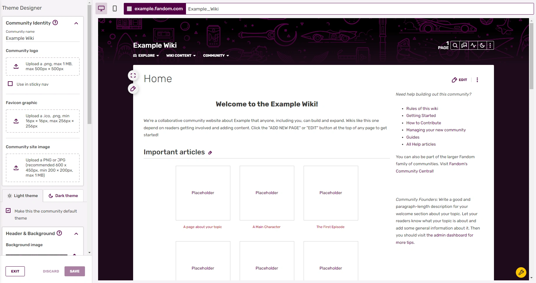
The Theme Designer is an easy-to-use admin tool that allows you to quickly customize your wiki's theme, header, and logo. You can choose from a pre-set theme when creating your wiki for the first time, or design your own unique theme that fits your community's topic for both light and dark themes.
Step-by-step
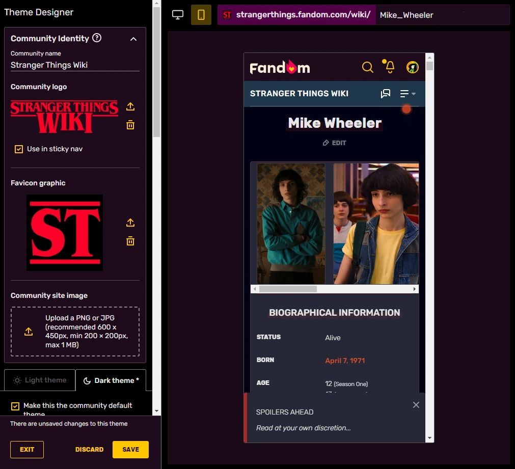
- As an admin of a community, you can find a link to the Theme Designer in the dropdown menu in the top right corner by hovering over the three vertical dots (⋮), in the My Tools menu on the toolbar, or in the Admin Dashboard. You can also navigate to it directly by visiting Special:ThemeDesigner on your wiki.
- There are three sections for customizing the wiki:
- Community identity: Set the wiki's name and community graphics.
- Header and background: Define the wiki background and color the local navigation.
- Article styles: Define the colors for the article background and links, plus choose a font for headings.
You can switch between the desktop and mobile preview with the icons in the top left hand corner of the preview window.
- Every change made is immediately seen within the preview window, so you can see how your theme will look before you save it, both on desktop and on mobile. You can switch between the desktop and mobile preview by using the respective desktop monitor and smartphone icon in the top left corner of the preview window.
- Admins can customize a light and dark theme on their wiki, accessible in the Theme Designer through separate tabs, and choose which of the two will be the community's default theme. All options under the "Header & Background" and "Article Styles" can be defined per theme. When switching tabs, the preview also changes to display whichever theme is being customized.
To ensure that themes meet accessibility requirements, admins will not be able to save a theming choice that has bad contrast warnings. See below for more details on this.
When you are finished and meet the contrast requirements, you can click "Save", and your new theme will appear to users instantly.
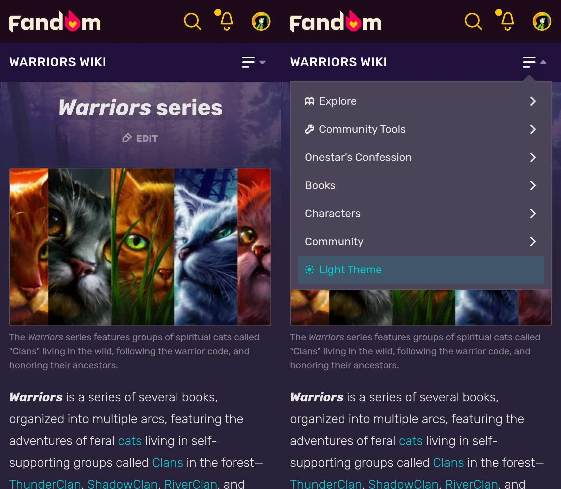
Mobile theming
Mobile theming is enabled by default for all communities across Fandom, except for those with color contrast issues or historically Gamepedia wikis using custom mobile CSS. Gamepedia wikis with mobile CSS will never have mobile theming turned on automatically, but it can be enabled by request by a Staff member. For wikis with contrast issues, upon opening the Theme Designer, admins will see a banner across the top that reads "Mobile theming is not yet turned on for this wiki. To enable mobile theming, please resolve any color contrast issues and save your changes." Once all contrast issues are manually resolved and the theme is saved, mobile theming will turn on automatically. Wherever mobile theming is newly enabled, admins will see a brief notification confirming it.
Users can easily switch between light and dark theme
To allow for a consistent aesthetic between the desktop and mobile experience, the colors set in the Theme Designer for the background, sticky nav, and header, as well as the accent, link, and article background colors will be the same on desktop and mobile. The chosen background image and heading font per theme will also be the same on desktop and mobile.
Note that not all options offered by the Theme Designer for desktop will be applicable to the mobile theme, and any additional changes made to the desktop theme with CSS will not apply to mobile.
The chosen default theme of light or dark will also be the default for the mobile theme. However, just as on desktop, each user will be able to choose their own theme experience on a personal basis. The personal theming choices one makes on mobile carry over to desktop and vice versa. More information about the light and dark theme experience can be found here.
Community identity
This section allows for the customization for the community name, logo, favicon, and site image. These settings are independent of light/dark themes and will display the same on both.
- Community name: You see the Community name in the header next to the logo. Note that this does not change the sitename of the wiki.
- Community logo: The community logo is a graphical addition to the community name. Users can navigate to their preferred landing page of the wiki by clicking the logo on any page.
- Logos can only be .png files, have a maximum size of 1 MB, and have a maximum size dimension of 500 × 500 pixels.
- The logo is stored at File:Site-logo.png.
- Use in sticky nav: will include the logo on the far left of the sticky nav, visible after scrolling down.
- Favicon graphic: Favicons are small icons that appear at the top of your browser and are frequently used in tabs and bookmarks.
- Favicons can be .ico or .png files and must be between 16 × 16 and 256 × 256 pixels in size. You can learn more about Favicons here.
- The favicon is stored at File:Site-favicon.ico.
- Community site image: This image will represent the community across Fandom and appear in various places including search and profile. As such, a high-quality image is recommended since it will appear in multiple sizes across different browsers and devices.
- The site image can be .png or .jpg, and the recommended size is 600 × 450 pixels with a minimum size of 200 × 200 pixels. The maximum upload size is 1 MB.
- The image is stored at File:Site-community-image.
Header and background
The background is the area outside of the content area and appears on all pages of your wiki. It can be a solid color, an image, or both.
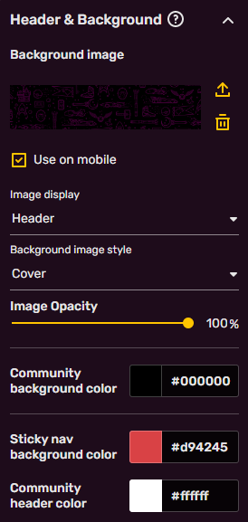
- Background image: If you'd like your wiki to have a background image, click in this area to upload one. The permitted file types are .jpg, .png, and .gif. The maximum file size is 1 MB.
- Help:Background has further information and recommendations related to creating a custom background image for your community.
- Below the upload area, there is an option for the chosen background image to be displayed on mobile as a header image. If left unchecked, it will not appear on the mobile theme. When enabling mobile theming, the default is to not show the background.
- Image display controls whether the image covers the entire screen or just the header area above the article. The background can be customized with a header (recommended 2880 × 656 pixels) or full-screen (recommended 2880px square) image.
- Background image style contains various options for how to display the image.
- Cover: stretches the smaller dimension of the image as much as needed to fill the full screen (equivalent to CSS
background-size:cover). - Tile: this repeats the background image across the page, with the options to do so horizontally, vertically, or both.
- Fit: the image will be aligned to the selected area (top left, center, or top right), and the larger dimension of the image will be stretched to fit (equivalent to CSS
background-size:contain).
- Cover: stretches the smaller dimension of the image as much as needed to fill the full screen (equivalent to CSS
- Image opacity sets how see-through the background image is against the background color. The lower the percentage, the more transparent the image becomes, which is useful to allow for better contrast of elements. Alternatively, you can adjust the community header text color to achieve this.
The following color choices will be applied to both the desktop and the mobile theme:
- Community background color: sets a solid background color for the wiki.
- Sticky nav background color: sets the background color of the sticky nav, visible at the top of the screen after scrolling down. Text color is automatically determined for contrast.
- Community header color: sets the text color of the community header nav. Pick something that has sufficient contrast with the background image and color, or you will not be able to save your theme.
Article styles
The following choices will be applied to both the desktop and the mobile theme:
- Headings font: allows for changing the font family of headings within articles. The default is "Rubik", though other other options are "Work Sans", "Lora", "Roboto Slab", "BioRhyme", and "Inknut Antiqua"
- Accent color: On desktop, the accent color is used on primary (filled) and secondary (outlined) buttons, the QuickBar, the comment counter on article/blog pages, infobox: the header, section header and border, and the vertical bar on site notices. On mobile, it's used on buttons, infobox borders, midlight (the color behind a text header/title), and on the toggle switcher.
- Link color: is the color of most links. Try to pick something that has good contrast with the article background, is distinct from normal text, and avoid red colors as red links denote missing pages.
- Article background color: is the background color of the main content area. The text color will be automatically determined for best contrast.
- Changing this will also change the background color of menu dropdowns (such as the navigation and "Edit" button dropdowns).
Theme history
- Every time a theme is saved with the "Save" button, an entry is created in this list. The list is unique for both the light and dark theme.
- If you would like to see or revert to a past version, you can do so. Click on a past version and it will load in the preview area.
- Only the last 10 versions are saved. Minimizing the amount of times you save by making all your changes at once will keep the history informative and usable.
Contrast warnings
The intent is to provide enough contrast between text and its background so that it can be read by people with moderately low vision. To ensure compliance, the Theme Designer's "SAVE" button is grayed out as long as contrast errors exist for one or more of the colors chosen on either of the themes, and an error message highlighting the problem will be present above the SAVE button. It is only after all required contrast errors for light and dark theme are resolved that the message near the SAVE button will disappear, and you can save your changes.

Red highlights indicate contrast errors in the Theme Designer, per color and per theme.
While errors are active, each affected color is highlighted by a red box around the chosen color, and the error text shows up in red with an octagonal error sign in front of it. Contrast warnings on the other hand are indicated with an orange box around the relevant color, and the warning text shows up in orange with a warning triangle in front of it. If the error is caused by color choices on the other theme, i.e. the light theme when you're looking at the dark theme, or vice versa, a red box will be present around the theme tab to draw attention to it. If the only issue on the other theme is a warning, the box around the theme tab will be orange.
The message for each color is unique and explains why this is an issue. You trigger this message by clicking on the color highlighted as having a problem. For each contrast issue, three colors on the spectrum adjacent to the one chosen that do meet the minimum contrast ratio will be presented to give admins an easy way to resolve the problem. This popup will remain open while looking for a new color, and the error or warning message will reappear if you switch the color to something that does not meet the contrast requirements. Once a good color solution is found, click on the "X" or outside the popup to make it disappear.
The required minimum contrast ratios (based on WCAG 2.x AA) are:
Link color vs article background - 4.5
If the problem lies with the link color on the chosen background color, you will read, "Links displayed in this color may be difficult to read. We recommend you pick another color that has better contrast with the background color."
Link underlines
Some color suggestions for the link color to fix this contrast issue will potentially cause the link color to be closer or too close to the text color, which is automatically defined on Fandom based on the article background color (#3a3a3a on light theme and #e6e6e6 on dark theme). This can disguise the links as regular text and make them harder to read. To counter this, when the chosen link color has less than a 1.5 contrast rating with the surrounding body text, the links will be underlined automatically to distinguish them properly. The underlines will disappear as soon as a link color with the proper contrast is selected, which can be seen in real time in the preview window. Note that underlines will only appear for links in the body text of wiki pages and will not be present in areas like the navigation bar, right rail, table of contents, templates or category pages.
Community background color vs community header color - 4.5
When the community background color and community header color do not have sufficient color contrast, they can make the local nav unreadable. If there are issues with the contrast here, the error message will read, "Links and text on this (background) color will be difficult for some users to read. Please pick another color that has better contrast with the community header color/community background color or select one of the recommended colors below."
Note that when a background image is present, this error will not appear, due to the fact that any contrast issues are covered up by the image. However, there is the option to not display the background image on mobile, so if an image is not being used there, the contrast issues will still be noticeable on the mobile view. In that case, we recommend solving the contrast error using the mobile preview window rather than the desktop preview.
The recommended minimum contrast ratios are:
Accent color vs article background color - 3.0
Because the accent color defines the colors of various wiki elements, such as buttons, elements of the infobox, and QuickBar, and is thus sometimes displayed over the article background color, a poor contrast choice can make this blend in with the background. Should this occur, the following error message will be displayed: "This color is used for infobox headers and borders, buttons, and other secondary interface elements. Please choose a color that has sufficient contrast to your wiki's article background color." This is simply a recommendation, not a strict requirement, so you will still be able to save your theme without having to adjust the accent color.
Keep in mind that only one color in each pair needs to be changed in order to meet contrast guidelines. When unable to resolve contrast issues in a satisfactory manner, please use the Zendesk form to reach Fandom Staff.
Further reading
- Learn more about how to create a custom background image for your community
- Learn more about your wiki's light and dark themes
- Learn more about contrast
- Learn how to edit the navigation bar
- Learn how to edit your My Tools
- Learn how to create web accessible content on Fandom
Further help and feedback
- Browse and search other help pages at Help:Contents
- Check Fandom Community Central for sources of further help and support
- Check Contacting Fandom for how to report any errors or unclear steps in this article