
A sample infobox
Infoboxes are like fact sheets, or sidebars in magazine articles, designed to present a summary of the topic of the page. They present important points in an organized and quickly readable format. Infoboxes are generally made using templates, to create consistency across a community.
Wikia has developed a new way to code infoboxes, called portable infoboxes to enable them to display well across different devices, which this page details. There are no changes to how you use an infobox on an article - instead, the changes affect how it is written on a template page. A tool to help with the migration of existing infoboxes has also been created - more information about this can be found on Help:Infobox migration.
- More discussion and background around this new type of infobox code can be found {{#NewWindowLink:http://community.wikia.com/index.php?title=Thread:918639%7Cthis thread}} ({{#NewWindowLink:http://community.wikia.com/index.php?title=Thread:841717%7Cplus older thread}}).
- For information on the 'classic' method of writing infoboxes, see Help:Classic infoboxes.
How to use an infobox
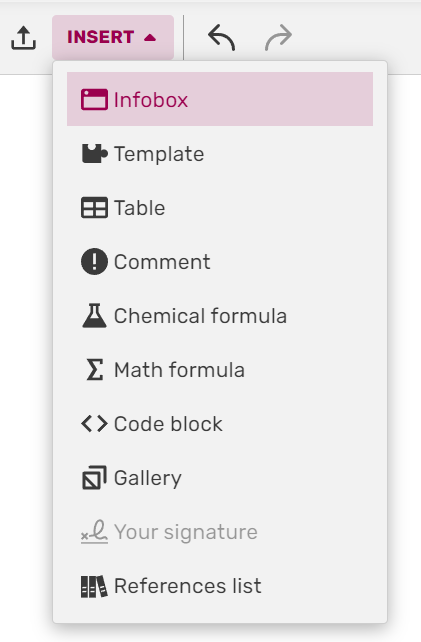
Inserting portable infoboxes in the VisualEditor
You can add an infobox to an article the same way as you would any other template - either via the editor's built-in tools, or through the editor's source mode. In the VisualEditor, portable infoboxes can quickly be inserted via the Infobox option on the 'Insert' dropdown.
Meanwhile, in source mode, you would generally start by copying the syntax from the template's documentation (normally found towards the bottom of the template's page) and pasting it into an article, changing the words after the equals signs to provide the desired information. For example:
{{infobox character
 | title         = Daisy
 | image         = Example.jpg
 | imagecaption  = Daisy, blowing in the wind
 | position      = Supreme flower
 | age           = 2 months
 | status        = Active
 | height        = 5 inches
 | weight        = 20 grams
}}
With portable infoboxes, this works just the same as with any other template. However, the template page markup is a little different, as detailed below.
Creating a new infobox
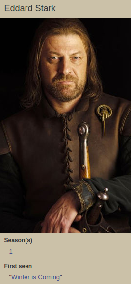
Winter is coming...
First, start new template with any name you like - Template:Example, for example. While in the past you may have used tables and divs, we now use infobox tags. We'll begin with a basic 'stacked' infobox, with a title and an image:
<infobox layout="stacked">
  <title source="name"><default>{{PAGENAME}}</default></title>
  <image source="image" />
</infobox>
This wikitext will tell your template to use name and image variables for title and image elements. Additionally you can provide the default tag, whose value will be used when a user does not specify a name/image/etc. on the article.
Now we just need two more fields containing additional information, so let's add one:
<data source="season"><label>Season(s)</label></data>
After adding one last field with source set to first and label to First seen, we end up with the following:
<infobox layout="stacked">
  <title source="name"><default>{{PAGENAME}}</default></title>
  <image source="image" />
  <data source="season"><label>Season(s)</label></data>
  <data source="first"><label>First seen</label></data>
</infobox>
We can now use the template in an article, inserting the following parameters to get a working infobox:
{{Example
 |name   = Eddard Stark
 |image  = eddard.jpg
 |season = [[Season 1|1]]
 |first  = "[[Winter is Coming]]"
}}
Styling and display
Infoboxes using this kind of code are automatically styled, taking cues from your community's custom theme. If any of the variables are empty, the relevant row of the template will not be displayed (unless the 'default' tag has been used).
Layout options
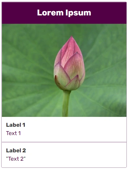
Two alternative layout options are available for infoboxes:
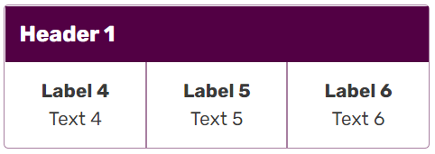
| Default (table) layout | Stacked layout |
|---|---|
| Labels are displayed to the left of the values | Labels are displayed above the values |
<infobox>
   ...
</infobox>
|
<infobox layout="stacked">
   ...
</infobox>
|


Custom theming
The default infobox theming can be overridden using local community CSS, and using the theme or theme-source attributes on the infobox tag will make it easy to target specific infobox templates using classes.
- The theme attribute is used to specify a custom CSS class for the infobox template.
- The theme-source attribute allows you to vary the CSS class via a template parameter.
For lots more information about how to use these attributes and theme an infobox, including detailed guides, please check out Help:Infoboxes/CSS!
Using videos
To add a video into an infobox, simply use the <image> tag - just as you would with an image. When a video is inserted instead of an image, a thumbnail with a play icon and duration info will be shown in the infobox, and clicking on the video will pop up a video player. If you want to add multiple videos, add a new <image> tag per each video.
Grouping data
Unusual orders and groups in action
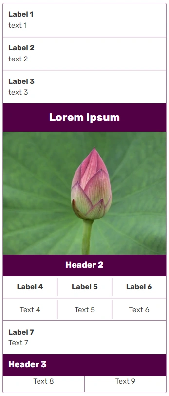
Now that you have created a simple infobox, you can learn how to use more advanced options. In the section below we show how to build the infobox seen on the right.
This infobox begins with three data fields, then title and image fields. As you can see, the title field does not have to be the first field.
<infobox layout="stacked">
  <data source="prev"><label>Previous</label></data>
  <data source="conc"><label>Concurrent</label></data>
  <data source="next"><label>Next</label></data>
  <title source="name" />
  <image source="image" />
</infobox>
Grouping information inside the group tags
The <group> field will let you group fields together and give them a header. Remember: fields that are declared but don't have a value won't appear. This rule also applies to groups - if none of the fields (other than the header tag) inside a group have a value, that whole group won't show up.
<infobox layout="stacked">
  <data source="prev"><label>Previous</label></data>
  <data source="conc"><label>Concurrent</label></data>
  <data source="next"><label>Next</label></data>
  <title source="name" />
  <image source="image" />
  <group>
    <header>Details</header>
    <data source="conflict"><label>Conflict</label></data>
    <data source="date"><label>Date</label></data>
    <data source="place"><label>Place</label></data>
    <data source="result"><label>Outcome</label></data>
  </group>
</infobox>
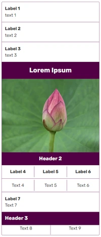
Alternative horizontal layout for groups

Horizontal grouping
Group tags can have a horizontal layout where all the content is displayed next to each other in single horizontal line. This can be achieved by adding layout="horizontal" attribute to the group tag.
<group layout="horizontal">
   ...
</group>
Force all group elements to be displayed
Using show="incomplete", you can force all group elements to be displayed, even when empty - unless all are empty, then the group is not rendered at all.
<group layout="horizontal" show="incomplete">
  <header>Combatants</header>
  <data source="side1" />
  <data source="side2" />
</group>
Now adding all this together, we come to the final template code:
<infobox layout="stacked">
  <data source="prev"><label>Previous</label></data>
  <data source="conc"><label>Concurrent</label></data>
  <data source="next"><label>Next</label></data>
  <title source="name" />
  <image source="image" />
  <group>
    <header>Details</header>
    <data source="conflict"><label>Conflict</label></data>
    <data source="date"><label>Date</label></data>
    <data source="place"><label>Place</label></data>
    <data source="result"><label>Outcome</label></data>
  </group>
  <group layout="horizontal" show="incomplete">
    <header>Combatants</header>
    <data source="side1" />
    <data source="side2" />
  </group>
  <group layout="horizontal" show="incomplete">
    <header>Commanders</header>
    <data source="commanders1" />
    <data source="commanders2" />
  </group>
  <group layout="horizontal" show="incomplete">
    <header>Strength</header>
    <data source="forces1" />
    <data source="forces2" />
  </group>
  <group layout="horizontal" show="incomplete">
    <header>Casualties</header>
    <data source="casual1" />
    <data source="casual2" />
  </group>
  <data source="civilian"><label>Civilian casualties</label></data>
</infobox>
Now we can use it in an article:
{{Battle
 |prev        = [[Battle of Fair Isle]]
 |conc        = [[Siege of Old Wyk]]
 |next        = [[Siege of Pyke]]
 |name        = [[Siege of Great Wyk]]
 |image       = Stannis Great Wyk.png
 |conflict    = [[Greyjoy Rebellion]]
 |date        = 289 AL
 |place       = [[Great Wyk]], the [[the Iron Islands]]
 |result      = [[Iron Throne]] victory
 |side1       = [[File:Greyjoy.png|20px|link=House Greyjoy]] [[House Greyjoy]]
 |side2       = [[File:Baratheon.png|20px|link=House Baratheon]] [[Iron Throne]]
 |commanders1 = Unknown
 |commanders2 = Lord [[Stannis Baratheon]]
 |casual1     = Unknown
 |casual2     = Unknown
}}
Advanced usage
Formatting
If you want to append some additional information to your data - like adding some icons, categories - or to process the passed values, the field formatting allows you to do that.
- When the format tag is used, the variable provided in source= is then formatted/modified as specified inside the format tag.
- If the variable provided in source= is empty, the node renders values provided in default tags (or doesn't render if default tags are not specified).
A few sample use cases:
- Extra text –
<format>${{{price}}}</format> - Links –
<format>[[{{{location}}}]]</format> - Categories –
<format>[[Category:{{{car type}}}]]</format>
For example, we can insert a {{money icon}} template:
<data source="price">
  <label>Price</label>
  <format>{{{price}}} {{money icon}}</format>
</data>
The effect shown to the right can be achieved with the following syntax:

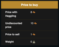
Fields with formatting
<header>Price to buy</header>
<data source="buyhaggle">
  <label>Price with Haggling</label>
  <format>{{{buyh}}} {{money icon}}</format>
</data>
<data source="buy">
  <label>Undiscounted price</label>
  <format>{{{buy}}} {{money icon}}</format>
</data>
<data source="sell">
  <label>Price to sell</label>
  <format>{{{sell}}} {{money icon}}</format>
</data>
<data source="weight">
  <label>Weight</label>
  <format>{{{weight}}} {{weight icon}}</format>
</data>
Parser functions
Parser functions can be added to any infobox. However, the results will be automatically hidden if the parameter, tag or data source do not contain any text.
| Template code | Output |
|---|---|
<data source="level">
  <label>Rank</label>
  <default>Orc {{#switch:{{{level}}}|1=peon|2=grunt|#default=grunt}}</default>
</data>
|
|
Available tags
For a detailed list of all the standard tags available for portable infoboxes, including samples of wikitext to use and their HTML output, please see Help:Infoboxes/Tags!
Examples
Further help and feedback
- Browse and search other help pages at Help:Contents
- Check Fandom Community Central for sources of further help and support
- Check Contacting Fandom for how to report any errors or unclear steps in this article