Infoboxes can be edited in two basic ways: visually or via source editor mode.
The default Infobox Builder is used for basic infobox creation and visually editing an infobox. It is likely that more complex changes and customization will require Infobox source edit mode.
Visual infobox editor
Editor sidebar functions
The Infobox Builder (located at Special:InfoboxBuilder) is the default editor for Portable Infoboxes. It loads when creating a new infobox template, or editing infobox templates without complex tags. To use it, you must also select the "Infobox" template classification when editing the infobox.
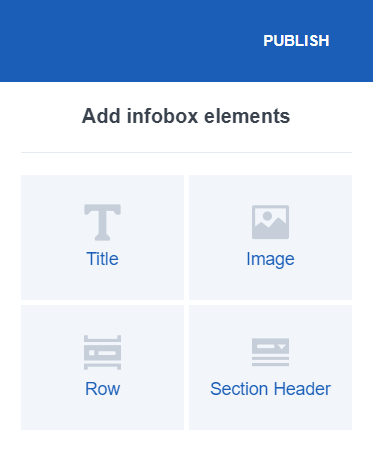
In the left side of the editor pane, there is a preview version of the infobox template. The right sidebar contains buttons for adding new items. Titles, headers, images and data rows are supported.
The infobox preview's items can be configured, by clicking on them and using the options pane in the right sidebar. The items can also be rearranged by dragging them around. To remove an item, click on it and use the trash can button on the left.
There are 4 types of item in the visual infobox editor. The following table provides their full information.
| Element Name | Information | Options | Has input field |
|---|---|---|---|
Title<title>
|
It provides the title of the infobox in an article. It could usually be the article's name. | Article Name: If this option was checked, the infobox title will automatically default to the article's name. | No |
Image<image>
|
It is a placeholder for an image or video, which is manually added to the infobox on an article page. The image takes the same width as the other infobox elements, except on desktop view when an inserted image is smaller than the infobox width. Captions will be automatically added after the addition of this element. | Upload Image to No image | Yes |
Row<data>
|
It provides a row. Next to it is the output in an article page. For example, the label would be something like "Eye Color", while the output in an article page would be "Brown" or "Blue". | None | Yes |
Section Header<header>
|
It organizes the infobox into sections. The label field can be used to specify the name of the section (e.g. physical description). Each row added under a header will automatically be a part of its section. | Collapsible: If this option is checked, users will be able to close and open sections when the infobox will be used on an article page. | Yes |
Row Episode Appears<episodeappears>
|
It organizes the infobox into sections. The label field can be used to specify the name of the section (e.g. physical description). Each row added under a header will automatically be a part of its section. | Collapsible: If this option is checked, users will be able to close and open sections when the infobox will be used on an article page. | Yes |
Infobox source edit mode

Click this to enter source edit mode
The source edit mode for infoboxes acts very similarly to the source edit mode for the general classic editor but you will see more XML tags used by portable infoboxes. The editor supports syntax highlighting.
- For a detailed list of all the standard options available for portable infoboxes, including samples of wikitext to use and their HTML output, see Help:Infoboxes/Tags
- For detailed information about how to use CSS to theme an infobox, including detailed guides, see Help:Infoboxes/CSS
- Portability Hub: Guides, examples, and personal mentoring for migrating, customizing, and theming your infoboxes