Many of your readers don't see your wiki the same way you do. They may have contrast sensitivity -- trouble reading text that has low contrast with the background color underneath it. While they may be able to make out black letters on a white background, other color combinations are much harder to read — and can even induce headaches.
Luckily, you can help them out. Obey web contrast standards and more people will be able to stay on your wiki longer.
A problem for all your readers
There are many eye maladies that can keep people away from your wiki. Glaucoma, retinopathy[1] and astigmatism are just a few. Although some of these are usually contracted by older people, they can strike everyone, of every age.
Yet it's not just the visually impaired who benefit from higher-contrast designs. Bad color combinations can, by themselves, induce eyestrain and discomfort, making even those with great eyesight turn away from your wiki.[2]
Contrast ratios
So how do you get higher contrast onto your wiki? Easy: contrast ratios. There's some pretty fancy math behind these web-standard ratios, but you don't need to understand any of it to make your wiki better.

All you need is an easy-to-use tool called a contrast analyzer. There are a ton of them out there to help you -- from browser extensions to websites. A great one is demonstrated at left, but there are surely others.
There are two web standards: AA and AAA. All contrast analyzers will make it obvious when you hit these targets. Accept no less than the AA contrast ratio between your background and text colors. But try for the higher AAA standard so that you can help a wider range of readers.
Size matters
Bigger letters don't need super-high contrast ratios to be easily readable. For that reason, you can usually express a little more creative freedom with section headers than you can with your normal article text.
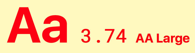
This combo only barely passes AA, and then only for large text. You should not use combos like this for your normal article text.
Generally, contrast analysers will tell you whether your achieved CR only applies to large text. If it doesn't say large, then it typically means the CR applies to both large and regular text.
But your wordmark typically has no minimum CR, it's too big and too stylised. That doesn't mean you should forget contrast altogether. A logo that's white will get lost on a white background. But if you're really set on using white-on-white, just throw some darker borders or shadows around it.
Best practices
There's a lot of debate about how best to offer contrast to readers — particularly when it comes to whether dark text on a light background is better than the reverse.[3] But there's virtually no debate about the importance of adhering to the W3C standards. Here are a few best practices that will help you achieve that goal.
- Please at least hit AA for your normal body copy — but try to get to AAA if you can.
- Make sure you're reading your CR analyser correctly. Match the ratio with the text size in which you're interested. It does your readers no good to have a color combo that works at 18px when you're examining the situation at 11px.
- Don't combine colors that are (even nearly) opposite from each other on the color wheel. Particularly bad combos? Red-on-green, cyan-on-red, green-on-magenta, red-on-blue, blue-on-yellow, and their reverses.[4]
Following these tips will help more people comfortably see your wiki — and therefore stay on it longer!
References
- ↑ Shaver, Kelli. "5 Ways to Ensure Your Site Is Accessible to the Visually Impaired". mashable.com. 20 April 2011.
- ↑ Sheedy, Jim and Kevin Larson Monitor. "Blink: the stress of reading". eyemagazine.com. Spring 2008.
- ↑ anthony. "When to Use White Text on a Dark Background". uxmovement.com. 28 April 2011. Read in particular the many comments at the bottom of the article.
- ↑ Gabriel-Petit, Pabini. "Applying Color Theory to Digital Displays". 20 January 2007. uxmatters.com Note that much of this article is out-of-date, as it pertains to types of displays that are not in wide use in 2018. Nevertheless, this one point, at least, still stands.
See also
Related topics here at Fandom
- A deeper explanation of contrast ratios
- Including the color blind at your wiki
- An overview of wiki design
- A video town hall about CSS with a section about color theory, starting roughly at the 58-minute mark.
Around the web
- An interactive examination of the importance of contrast in web design
- Colorable, a simple contrast-checker for when you're planning your wiki's color palette.
- CheckMyColours - a tool for checking all your wiki's current foreground and background color combinations.
- The Braille Institute's digital tech section and various free apps that help you simulate several eye disorders.
Further help and feedback
- Browse and search other help pages at Help:Contents
- Check Fandom Community Central for sources of further help and support
- Check Contacting Fandom for how to report any errors or unclear steps in this article