Contrast ratios describe a mathematical relationship between background and foreground of a bit of text on your wiki. While contrast analyzing tools make it easy to find good, high contrast color combinations without doing any math yourself, you may want to explore the math more deeply.
Understanding visual acuity

We're all shooting for the 20/20 line on this American eye chart.
First, let's explore a concept called visual acuity. It's a measurement of how well you can read black letters on a white background from a particular distance -- and it's something you've probably done before.
Think about your eye doctor's office. In the US, patients are seated 20 feet from the chart. Visual acuity is a fraction where the numerator is 20 and the denominator is the number assigned to that line on the chart, Statistically average visual acuity is being able to read the line marked 20 from 20 feet away: 20/20[1] — or 6/6, if you use the metric system.
Finding the contrast ratio
The visual acuity fraction is directly related to contrast ratios — a mathematical expression of the comfort a person has in reading your wiki.
Put another way, a contrast ratio is the relationship between the brightnesses of the background color and the text color. The highest ratio is 21:1, which is black text on a white background, while the lowest is 1:1 — where both background and text are the same color.
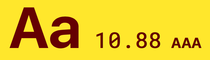
Adhering to the web standard doesn't mean you're stuck with boring blacks and whites. This gold-and-purple combo easily passes the AAA mark, as do tens of thousands of others.
A person with 20/20 vision could probably see a page with a 2:1 contrast ratio, but it wouldn't be pleasant. So the minimum contrast ratio for the normally-sighted is 3:1.
But you can't deliver a wiki that's only good for people with 20/20 vision. That's why the World Wide Web Consortium (W3C) recommends two standards: AA and AAA.
With AA, the aim is to account for people who have 20/40 vision by providing a CR of 4.5:1 for regular text, and 3:1 for larger copy. AAA has a minimum contrast ratio of 7:1. This higher rating will allow people with 20/80 vision to comfortably use your wiki. Those with worse than 20/80 vision usually employ additional assistive technologies, making that the lowest visual acuity that needs to be considered by your CSS alone.[2]