m (+ja) Tag: Help |
(Interwiki Link: +fr.) |
||
| (3 intermediate revisions by 2 users not shown) | |||
| Line 2: | Line 2: | ||
== Understanding visual acuity == |
== Understanding visual acuity == |
||
| ⚫ | |||
| − | {{TOCright}} |
||
| ⚫ | |||
Consider '''visual acuity'''. It's a measurement of how well you can read black letters on a white background from a particular distance, and it's something you've probably done before. |
Consider '''visual acuity'''. It's a measurement of how well you can read black letters on a white background from a particular distance, and it's something you've probably done before. |
||
| Line 23: | Line 22: | ||
== See also == |
== See also == |
||
| − | === Related topics here at |
+ | === Related topics here at Fandom === |
* [[Help:Contrast|An introduction to this topic]] |
* [[Help:Contrast|An introduction to this topic]] |
||
* [[Help:Including the color blind at your wiki|Including the color blind at your wiki]] |
* [[Help:Including the color blind at your wiki|Including the color blind at your wiki]] |
||
| Line 31: | Line 30: | ||
=== Around the web === |
=== Around the web === |
||
*[http://contrastrebellion.com An interactive examination of the importance of contrast in web design] |
*[http://contrastrebellion.com An interactive examination of the importance of contrast in web design] |
||
| − | * [https://colorable.jxnblk.com Colorable], a simple contrast-checker for when you're planning your wiki's color palette. |
+ | * [https://colorable.jxnblk.com Colorable], a simple contrast-checker for when you're planning your wiki's color palette. |
* [http://www.checkmycolours.com CheckMyColours] - a tool for checking '''all''' your wiki's current foreground and background color combinations. |
* [http://www.checkmycolours.com CheckMyColours] - a tool for checking '''all''' your wiki's current foreground and background color combinations. |
||
* [http://www.brailleinstitute.org/digital.html The Braille Institute's digital tech section] and various [http://www.brailleinstitute.org/digital/mobile-applications.html free apps] that help you simulate several eye disorders. |
* [http://www.brailleinstitute.org/digital.html The Braille Institute's digital tech section] and various [http://www.brailleinstitute.org/digital/mobile-applications.html free apps] that help you simulate several eye disorders. |
||
== Further help and feedback == |
== Further help and feedback == |
||
| − | {{Help and feedback section}} |
+ | {{Help and feedback section}}[[fr:Aide:Contraste/Avancé]] |
| − | [[category:help]] |
||
[[ja:ヘルプ:コントラスト/高度な情報]] |
[[ja:ヘルプ:コントラスト/高度な情報]] |
||
| + | [[tr:Yardım:Kontrast/Gelişmiş]] |
||
| + | [[Category:Help]] |
||
Revision as of 15:36, 29 August 2020
Contrast ratios describe a mathematical relationship between the background and foreground of a bit of text on your wiki. That math gives a wider range of people the opportunity to comfortably read your wiki.
Understanding visual acuity

We're all shooting for the 20/20 line on this American eye chart.
Consider visual acuity. It's a measurement of how well you can read black letters on a white background from a particular distance, and it's something you've probably done before.
Think about your eye doctor's office. In the US, patients are seated 20 feet from the chart. Visual acuity is a fraction where the numerator is 20 and the denominator is the number assigned to that line on the chart, Statistically average visual acuity is being able to read the line marked 20 from 20 feet away: 20/20[1] — or 6/6, if you use the metric system.
Finding the contrast ratio
The visual acuity fraction is directly related to the contrast ratio — a mathematical expression of the comfort a person has in reading your wiki. The highest ratio is 21:1, which is black text on a white background — or white text on a black background. The lowest is 1:1, meaning that both background and text are the same color.
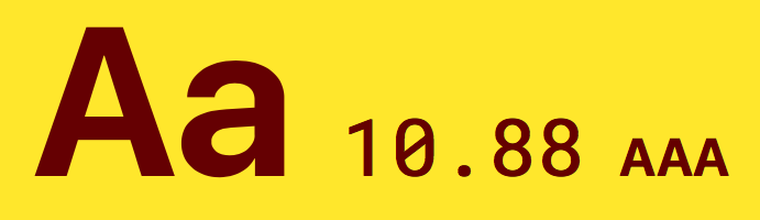
Adhering to the web standard doesn't mean you're stuck with boring blacks and whites. This gold-and-purple combo easily passes the AAA mark, as do tens of thousands of others.
A person with 20/20 vision could probably see a page with a 2:1 contrast ratio, but it wouldn't be pleasant. So the minimum contrast ratio for the normally-sighted is 3:1.
But you can't deliver a wiki that's only good for people with 20/20 vision. That's why the World Wide Web Consortium (W3C) recommends two standards: AA and AAA.
With AA, the aim is to account for people who have 20/40 vision by providing a CR of 4.5:1 for regular text, and 3:1 for larger copy. AAA has a minimum contrast ratio of 7:1.
This higher rating will allow people with 20/80 vision to comfortably use your wiki. Those with worse than 20/80 vision usually employ additional assistive technologies, making that the lowest visual acuity that needs to be considered by your CSS alone.[2]
References
See also
Related topics here at Fandom
- An introduction to this topic
- Including the color blind at your wiki
- An overview of wiki design
- A video town hall about CSS with a section about color theory, starting roughly at the 58-minute mark.
Around the web
- An interactive examination of the importance of contrast in web design
- Colorable, a simple contrast-checker for when you're planning your wiki's color palette.
- CheckMyColours - a tool for checking all your wiki's current foreground and background color combinations.
- The Braille Institute's digital tech section and various free apps that help you simulate several eye disorders.
Further help and feedback
- Browse and search other help pages at Help:Contents
- Check Fandom Community Central for sources of further help and support
- Check Contacting Fandom for how to report any errors or unclear steps in this article