No edit summary |
m (→Contact Fandom Staff: Mass editing of links) Tag: Help |
||
| (4 intermediate revisions by 4 users not shown) | |||
| Line 1: | Line 1: | ||
| ⚫ | |||
| − | <jwplayer media-id="oRSYWZ8N" /> |
||
| ⚫ | |||
| − | ::''As a reminder about Mobile Best Practices: You can always preview what your edits will look like on a mobile device by adding <code |
+ | ::''As a reminder about Mobile Best Practices: You can always preview what your edits will look like on a mobile device by adding <code>?useskin=mercury</code> to the end of a Fandom URL, or if you are using classic editor, when previewing your edits, you can select ‘mobile’ from the drop down menu in the top left-hand corner of the preview screen.'' |
| − | ==What are |
+ | == What are nested tables? == |
| − | Nested tables are simply tables within tables |
+ | Nested tables are simply tables within tables within tables (also known as table inception!) |
| − | + | Here is an example of nested tables on our Brave Frontier community. Note the difference between the clean desktop view and the less than optimal mobile view. |
|
| ⚫ | |||
| ⚫ | |||
| ⚫ | |||
| − | |||
| ⚫ | |||
You should avoid using nested tables whenever possible. Tables, in general, always take up the smallest width they can and even extend vertically when the horizontal space is limited. However, if a table is placed inside another table, that forces the width of these cells to accommodate the additional table. In essence, this forces the entire table structure to be much wider than space allows. This is especially bad for mobile display, because the size of the screen is so much smaller. |
You should avoid using nested tables whenever possible. Tables, in general, always take up the smallest width they can and even extend vertically when the horizontal space is limited. However, if a table is placed inside another table, that forces the width of these cells to accommodate the additional table. In essence, this forces the entire table structure to be much wider than space allows. This is especially bad for mobile display, because the size of the screen is so much smaller. |
||
| Line 18: | Line 16: | ||
This also allows each table to be more dynamic. The content formatting is dictated by the size of the mobile screen. Therefore, the browser will move the tables to where they can be displayed to improve the overall flow of content scrolling. |
This also allows each table to be more dynamic. The content formatting is dictated by the size of the mobile screen. Therefore, the browser will move the tables to where they can be displayed to improve the overall flow of content scrolling. |
||
| − | ==What to do if your community uses |
+ | == What to do if your community uses nested tables == |
Encourage them to break up the nested tables and attempt to create an infrastructure that is not dependent on tables within tables. Per above, stacking tables next to each other can often times achieve the same result. If the content is best presented in a table format, you can always adjust the cells in such a way that they resemble another table within a table, but still only be one big table. |
Encourage them to break up the nested tables and attempt to create an infrastructure that is not dependent on tables within tables. Per above, stacking tables next to each other can often times achieve the same result. If the content is best presented in a table format, you can always adjust the cells in such a way that they resemble another table within a table, but still only be one big table. |
||
| − | ==Best |
+ | == Best practices for avoiding nested tables == |
| − | ===How to identify nested tables=== |
+ | === How to identify nested tables === |
In the source code, tables always begin with the wikitext <code><nowiki>{|</nowiki></code> or HTML <code><nowiki><table></nowiki></code>. Tables are closed with the opposite code: <code><nowiki>|}</nowiki></code> or <code><nowiki></table></nowiki></code>. Therefore, if you see the beginning of a table, and before you arrive at the closing brackets of that table, you encounter another beginning of a table, this indicates a table nested within a table. This could go down several layers deep. |
In the source code, tables always begin with the wikitext <code><nowiki>{|</nowiki></code> or HTML <code><nowiki><table></nowiki></code>. Tables are closed with the opposite code: <code><nowiki>|}</nowiki></code> or <code><nowiki></table></nowiki></code>. Therefore, if you see the beginning of a table, and before you arrive at the closing brackets of that table, you encounter another beginning of a table, this indicates a table nested within a table. This could go down several layers deep. |
||
| − | + | Here is the source code example of a nested table: |
|
| − | [[File: |
+ | [[File:Example code 1024.png|center|500px]] |
| + | |||
| − | ===How to break down nested tables=== |
+ | === How to break down nested tables === |
The first step is to identify how many tables are nested within the main table. |
The first step is to identify how many tables are nested within the main table. |
||
The second step is to find the furthest nested table (or most deeply rooted) table, and pull it out of the chain of nested tables. |
The second step is to find the furthest nested table (or most deeply rooted) table, and pull it out of the chain of nested tables. |
||
Now, hit preview, and you will get an idea of what that table looks like on its own. |
Now, hit preview, and you will get an idea of what that table looks like on its own. |
||
After hitting preview, you can troubleshoot tables it they don't look as expected by checking the parameters of the table (the code immediately following the table opening: <code><nowiki>{|</nowiki></code>) |
After hitting preview, you can troubleshoot tables it they don't look as expected by checking the parameters of the table (the code immediately following the table opening: <code><nowiki>{|</nowiki></code>) |
||
| + | |||
Once you have pulled all of the internal tables out of the main table, you should be able to delete the original table code. Now the tables should be stacked for mobile-optimized display. |
Once you have pulled all of the internal tables out of the main table, you should be able to delete the original table code. Now the tables should be stacked for mobile-optimized display. |
||
| − | ===How to preserve your desktop display now that the tables are separate=== |
+ | === How to preserve your desktop display now that the tables are separate === |
Tables should be stacked top-to-bottom or side-by-side. This will allow your mobile browser to push and move the tables around to fit within the space allotted on the mobile display. If the tables are side-by-side and they don’t fit within the width of the mobile screen, the browser will automatically push the last table below. |
Tables should be stacked top-to-bottom or side-by-side. This will allow your mobile browser to push and move the tables around to fit within the space allotted on the mobile display. If the tables are side-by-side and they don’t fit within the width of the mobile screen, the browser will automatically push the last table below. |
||
However, one of the biggest challenges that you will face in this stage of positioning your tables is finding a compromise between how they appear on the desktop versus how they appear on the mobile display. This may require adjusting the inline CSS to control how the tables look on the desktop display. Writing CSS into your table wikitext will only affect the desktop version, so the mobile version will still be displayed correctly. If you need more individual help with table positioning, see the list of resources at the bottom of the page. |
However, one of the biggest challenges that you will face in this stage of positioning your tables is finding a compromise between how they appear on the desktop versus how they appear on the mobile display. This may require adjusting the inline CSS to control how the tables look on the desktop display. Writing CSS into your table wikitext will only affect the desktop version, so the mobile version will still be displayed correctly. If you need more individual help with table positioning, see the list of resources at the bottom of the page. |
||
| − | ==More |
+ | == More useful info about nested tables == |
Keep in mind, if a template is being used to display one table for various different pages, fixing the nested table issue on that template will also fix the mobile display for all of the pages that contain the template as well. This means that applying this optimization practice to your templates could have a huge impact for your overall community. |
Keep in mind, if a template is being used to display one table for various different pages, fixing the nested table issue on that template will also fix the mobile display for all of the pages that contain the template as well. This means that applying this optimization practice to your templates could have a huge impact for your overall community. |
||
Tables with images within individual cells will force the cell to conform to the image size. Therefore, images should be sized down to a mobile-friendly size, or pulled out of table cells entirely. If the image is very large and outside of the table, the mobile browser will automatically size it down to fit in the mobile display. |
Tables with images within individual cells will force the cell to conform to the image size. Therefore, images should be sized down to a mobile-friendly size, or pulled out of table cells entirely. If the image is very large and outside of the table, the mobile browser will automatically size it down to fit in the mobile display. |
||
| − | ==Brave Frontier |
+ | == Brave Frontier community case study == |
| − | The [[w:c:bravefrontierglobal|Brave Frontier]] community was nice enough to be our guinea pig/co-conspirators in this effort to eradicate |
+ | The [[w:c:bravefrontierglobal|Brave Frontier]] community was nice enough to be our guinea pig/co-conspirators in this effort to eradicate nested tables. We were able to successfully find the balance between breaking down nested tables for one of their most important templates (character template) while still preserving the look and feel of their desktop view. The result is a much improved mobile layout for a huge number of articles on their community. See for yourselves: |
| − | |||
<gallery widths="350" position="center" spacing="large" hideaddbutton="true"> |
<gallery widths="350" position="center" spacing="large" hideaddbutton="true"> |
||
| − | Desktop BF.png|Desktop before and after. You will notice that the layout is basically unchanged. |
+ | Desktop BF.png | Desktop before and after. You will notice that the layout is basically unchanged. |
| − | Mobile BF.png|Mobile view before and after. Here is the big change. The content was made more mobile friendly, and therefore is displayed in a meaningful way. |
+ | Mobile BF.png | Mobile view before and after. Here is the big change. The content was made more mobile friendly, and therefore is displayed in a meaningful way. |
</gallery> |
</gallery> |
||
| − | <br clear="all"/> |
||
If you are a more technical admin and would like to see exactly what changes were made to the source code on Brave Frontier to optimize it for mobile display, you can view the source code before and after the changes were made: |
If you are a more technical admin and would like to see exactly what changes were made to the source code on Brave Frontier to optimize it for mobile display, you can view the source code before and after the changes were made: |
||
| − | *[ |
+ | * [https://bravefrontierglobal.fandom.com/wiki/Template:Unit?action=edit&oldid=78459 Before mobile optimization (Source Code)] |
| + | * [https://bravefrontierglobal.fandom.com/wiki/Template:Unit?action=edit After mobile optimization (Source Code)] |
||
| − | ::''Note: this |
+ | :: ''Note: this template has been protected to prevent unwanted changes. If you’d like to copy the template for your own use, please copy the code and paste it on your own community or sandbox.'' |
| − | ==More |
+ | == More resources == |
| − | *[[Help:Tables]] |
+ | * [[Help:Tables]] |
| − | *[[Help: |
+ | * [[Help:Personal CSS and JS]] |
| − | *[[Help:Mobile]] |
+ | * [[Help:Mobile]] |
| − | *[[Board:Support Requests - Getting Technical]] |
+ | * [[w:Board:Support Requests - Getting Technical]] |
| − | ==Contact |
+ | == Contact Fandom Staff == |
Do you need help with converting nested tables on your community? Reach out to us at [[Special:Contact]]. Please add '''Mobile: Nested tables''' to the subject line. |
Do you need help with converting nested tables on your community? Reach out to us at [[Special:Contact]]. Please add '''Mobile: Nested tables''' to the subject line. |
||
| − | |||
| − | {{HelpFooter}} |
||
[[de:Hilfe:Verschachtelte Tabellen vermeiden]] |
[[de:Hilfe:Verschachtelte Tabellen vermeiden]] |
||
| Line 78: | Line 75: | ||
[[pt:Ajuda:Evitando tabelas aninhadas]] |
[[pt:Ajuda:Evitando tabelas aninhadas]] |
||
[[ru:Справка:Таблицы/избегайте вложенных таблиц]] |
[[ru:Справка:Таблицы/избегайте вложенных таблиц]] |
||
| + | [[tr:Yardım:İç içe tablolardan kaçınma]] |
||
[[uk:Довідка:Таблиці/уникайте вкладених таблиць]] |
[[uk:Довідка:Таблиці/уникайте вкладених таблиць]] |
||
[[vi:Trợ giúp:Tránh lồng bảng]] |
[[vi:Trợ giúp:Tránh lồng bảng]] |
||
| Line 83: | Line 81: | ||
[[Category:Help]] |
[[Category:Help]] |
||
[[Category:Mobile]] |
[[Category:Mobile]] |
||
| − | [[Category:Mobile intro |
+ | [[Category:Mobile intro]] |
Revision as of 06:51, 1 December 2019
There are many different common wikitext practices that, while useful to high level users on the desktop, unfortunately interfere with how their content is displayed on other platforms (such as mobile). Nested tables are a prime example.
- As a reminder about Mobile Best Practices: You can always preview what your edits will look like on a mobile device by adding
?useskin=mercuryto the end of a Fandom URL, or if you are using classic editor, when previewing your edits, you can select ‘mobile’ from the drop down menu in the top left-hand corner of the preview screen.
- As a reminder about Mobile Best Practices: You can always preview what your edits will look like on a mobile device by adding
What are nested tables?
Nested tables are simply tables within tables within tables (also known as table inception!)
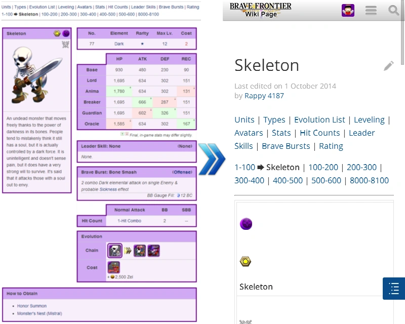
Here is an example of nested tables on our Brave Frontier community. Note the difference between the clean desktop view and the less than optimal mobile view.
Why would nested tables be bad?
You should avoid using nested tables whenever possible. Tables, in general, always take up the smallest width they can and even extend vertically when the horizontal space is limited. However, if a table is placed inside another table, that forces the width of these cells to accommodate the additional table. In essence, this forces the entire table structure to be much wider than space allows. This is especially bad for mobile display, because the size of the screen is so much smaller.
The outcome: This causes a lot of horizontal scrolling on mobile (a bad user experience), and much of the table is hidden from view. If you break up the nested tables into several independent tables, the information is displayed on a vertical scroll down the page, rather than a horizontal one.
This also allows each table to be more dynamic. The content formatting is dictated by the size of the mobile screen. Therefore, the browser will move the tables to where they can be displayed to improve the overall flow of content scrolling.
What to do if your community uses nested tables
Encourage them to break up the nested tables and attempt to create an infrastructure that is not dependent on tables within tables. Per above, stacking tables next to each other can often times achieve the same result. If the content is best presented in a table format, you can always adjust the cells in such a way that they resemble another table within a table, but still only be one big table.
Best practices for avoiding nested tables
How to identify nested tables
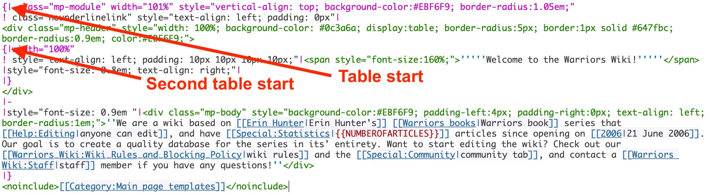
In the source code, tables always begin with the wikitext {| or HTML <table>. Tables are closed with the opposite code: |} or </table>. Therefore, if you see the beginning of a table, and before you arrive at the closing brackets of that table, you encounter another beginning of a table, this indicates a table nested within a table. This could go down several layers deep.
Here is the source code example of a nested table:
How to break down nested tables
The first step is to identify how many tables are nested within the main table.
The second step is to find the furthest nested table (or most deeply rooted) table, and pull it out of the chain of nested tables.
Now, hit preview, and you will get an idea of what that table looks like on its own.
After hitting preview, you can troubleshoot tables it they don't look as expected by checking the parameters of the table (the code immediately following the table opening: {|)
Once you have pulled all of the internal tables out of the main table, you should be able to delete the original table code. Now the tables should be stacked for mobile-optimized display.
How to preserve your desktop display now that the tables are separate
Tables should be stacked top-to-bottom or side-by-side. This will allow your mobile browser to push and move the tables around to fit within the space allotted on the mobile display. If the tables are side-by-side and they don’t fit within the width of the mobile screen, the browser will automatically push the last table below.
However, one of the biggest challenges that you will face in this stage of positioning your tables is finding a compromise between how they appear on the desktop versus how they appear on the mobile display. This may require adjusting the inline CSS to control how the tables look on the desktop display. Writing CSS into your table wikitext will only affect the desktop version, so the mobile version will still be displayed correctly. If you need more individual help with table positioning, see the list of resources at the bottom of the page.
More useful info about nested tables
Keep in mind, if a template is being used to display one table for various different pages, fixing the nested table issue on that template will also fix the mobile display for all of the pages that contain the template as well. This means that applying this optimization practice to your templates could have a huge impact for your overall community.
Tables with images within individual cells will force the cell to conform to the image size. Therefore, images should be sized down to a mobile-friendly size, or pulled out of table cells entirely. If the image is very large and outside of the table, the mobile browser will automatically size it down to fit in the mobile display.
Brave Frontier community case study
The Brave Frontier community was nice enough to be our guinea pig/co-conspirators in this effort to eradicate nested tables. We were able to successfully find the balance between breaking down nested tables for one of their most important templates (character template) while still preserving the look and feel of their desktop view. The result is a much improved mobile layout for a huge number of articles on their community. See for yourselves:
")
")
If you are a more technical admin and would like to see exactly what changes were made to the source code on Brave Frontier to optimize it for mobile display, you can view the source code before and after the changes were made:
- Note: this template has been protected to prevent unwanted changes. If you’d like to copy the template for your own use, please copy the code and paste it on your own community or sandbox.
More resources
Contact Fandom Staff
Do you need help with converting nested tables on your community? Reach out to us at Special:Contact. Please add Mobile: Nested tables to the subject line.